Oscraps
Search results
-

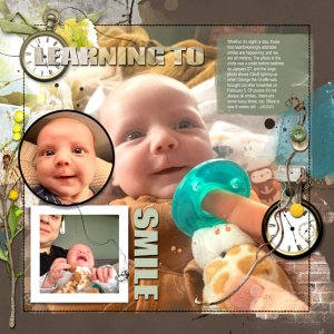
Learning to Smile
Those first smiles melt your heart....but the crying is pretty darn cute, too. I am loving the new FotoInspired Templates! Here I used Artsy Paper #6 from the Home APP for my background, augmented with some transfers/overlays. The embellishments are from the Tinge Artplay Palette, with the...- musicmom3
- Media item
- baby fotoinspired
- Comments: 11
- Category: Anna Aspnes
-

Comment by 'musicmom3' in media 'The Meeting/Anna lift'
A murder of crows...very mysterious and moody, perfect for the painting.- musicmom3
- Gallery comment
-

Comment by 'musicmom3' in media 'small-everyday-moments'
Awesome way to focus on what's important. Our eyes go right to what matters, bravo!- musicmom3
- Gallery comment
-

Comment by 'musicmom3' in media 'The sound of #challenge 7'
Such eye-grabbing strong lines here. Love it!- musicmom3
- Gallery comment
-

Comment by 'musicmom3' in media 'Annalift .jpg Paper Collage a Picasso circa 1912'
Very rich texture here!- musicmom3
- Gallery comment
-

Comment by 'musicmom3' in media 'Lift: Mouly'
Beautiful layout...and I like your use of color blocking to encourage a pause as we take it all in. Sounds like you got the better part of the career choice BTW. :)- musicmom3
- Gallery comment
-

Comment by 'musicmom3' in media 'Quaint Pub - Portiere'
Loving the brickwork coming off of the photo. Love the photo too!- musicmom3
- Gallery comment
-

Comment by 'musicmom3' in media 'The Measure/Anna color chall'
Love your pairing of words and imagery.- musicmom3
- Gallery comment
-

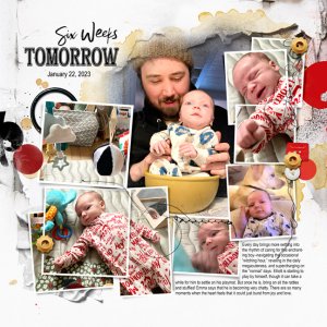
Six Weeks Tomorrow
I got the idea for this page from a recent aA blog inspiration post, where an accent color that wasn't in the Artplay Palette was called into play. I used that idea here, adding yellow accents to the red of the Cosmopolis Release supplies, to highlight the bowl in the central photo. In keeping...- musicmom3
- Media item
- Comments: 8
- Category: Anna Aspnes
-

Comment by 'musicmom3' in media 'anna-aspnes-digital-art-artplay-sayonara-diane-painting.jpg'
Don't be surprised if you see me copying you on this. Awesome organization of imagery and journaling.- musicmom3
- Gallery comment
-

Comment by 'musicmom3' in media 'Winter Woods'
Seamless blending of the imagery. Wowzers! And of course anything with sheep immediately steals my heart!- musicmom3
- Gallery comment
-

Comment by 'musicmom3' in media 'anna-color-challenge-01.27.2023-02.09.2023-memories-viv.jpg'
Delightful! And mysterious. Gorgeous work!- musicmom3
- Gallery comment
-

Comment by 'musicmom3' in media 'Vivify #challenge4'
Perfect imagery for the poem. The mood is exquisite.- musicmom3
- Gallery comment
-

Comment by 'musicmom3' in media 'AnnaLift: Under Construction'
Love the colors here, and the varying scales of the ironwork. The antelope creature is very mysterious!- musicmom3
- Gallery comment
-

Comment by 'musicmom3' in media 'Back to Work'
Other than compulsive documentation LOL, the only reason I can think of about my date-mania is that establishing time (and, in my case, place) suggests some control over this crazy world. With baby layouts it is natural, I guess, as there really are big differences between one week and the next...- musicmom3
- Gallery comment
-

Comment by 'musicmom3' in media 'Mrs Brodie's buttons.jpg'
I love the sheer exuberance of this! I also love the figure positioned way on the left, in anticipation as she approaches the fun. I had a button box to play with, too, and it was a Big Deal!- musicmom3
- Gallery comment
-

Comment by 'musicmom3' in media 'anna-aspnes-digital-art-artplay-portiere-diane-newyear.jpg'
I want to party with you! I love red too, and it's amazing how it can function as a neutral in some situations, holding everything together as it does here. Nice haircut!- musicmom3
- Gallery comment
-

Comment by 'musicmom3' in media 'anna-aspnes-digital-art-artplay-collection-portiere-jerri-lantz-us.jpg'
Furbaby cuteness! The bead string is a great anchor for the bottom of the photo. The central location of the photo on the page really works for me, as all the eyes are looking right back at us as we look into them!- musicmom3
- Gallery comment
