Oscraps
Search results
-

How do you watch the news, or not at all?
Nee inderdaad raakte er van streek van. The news makes you indeed sad, it upset me -

How do you watch the news, or not at all?
Stop watching years a decade ago after living with a news junkie (my mom) for a while. -

Comment by 'Nickel' in media 'my-favorite-city.jpg'
Another stunning one! You are on arol!- Nickel
- Gallery comment
-

Comment by 'Nickel' in media 'Lazy Dog Days'
Wat a sweet cute doggie lay out!- Nickel
- Gallery comment
-

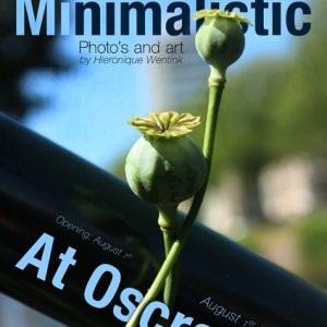
Aug-Challenge-2-o-agency
Made for the O agency. I borrowed the title from @zotova , used the gradient to made the color somewhat deeper and used a page mask to give some texture on the poster- Nickel
- Media item
- challenge 2
- Comments: 7
- Category: Oscraps Cheery O's
-

Comment by 'Nickel' in media 'Goodbye Diet'
Ymmie lay out with a stunning page design!- Nickel
- Gallery comment
-

Comment by 'Nickel' in media 'challenge5'
love the use of the silhoulette! I want some sun and heat too- Nickel
- Gallery comment
-

Comment by 'Nickel' in media 'MINIMALISM-IN-PHOTOGRAPHY.jpg'
Love the use of the silhouette!- Nickel
- Gallery comment
-

Weird/odd interests or hobbies?
And then you make wonderful photos of them.. -

Comment by 'Nickel' in media 'It's about time'
Love the use of the big clock! Great photo treatment!- Nickel
- Gallery comment
-

Comment by 'Nickel' in media 'Let Life Unfold - AnnaLift Challenge'
Great blending! Congrats at your accomplishment!- Nickel
- Gallery comment
-

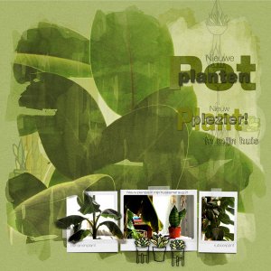
Comment by 'Nickel' in media 'New potted Plants are new plant pleasure'
verslaafd misschien niet maar ik vind ze heel leuk en ze blijven stil staan, ideale foto object- Nickel
- Gallery comment
-

New potted Plants are new plant pleasure
Made for the Multi photo challenge I used 4 photos. I used two painted mask and blended them. I also used masks (and brushed) to get an OOB effect. I got the Helvetica font family on my computer. I really love Helvetica and I lo ved to play with all those variations.- Nickel
- Media item
- #joanne brisebois multi photo challen plants potted plants
- Comments: 4
- Category: Oscraps Cheery O's
-

Comment by 'Nickel' in media 'my guy'
Stunning page composition! Congrats you were featured on the OFacebook!- Nickel
- Gallery comment
