Oscraps
Search results
-

Comment by 'ksacry' in media 'anna-aspnes-digital-art-project-2022-diane-PTA8-december7.jpg'
Cute page. Love the way you integrated the artsy stuff! I like how you handled the coloring.- ksacry
- Gallery comment
-

Comment by 'ksacry' in media 'Tilly Frolicking - Frolic ArtsyKardz'
Wonderfully blended! I have issues with the straight lines of the ArtsyKards, so I don't use them much. You have done a wonderful job of covering those straight lines so they are not noticeable at all. Guess I should try it.- ksacry
- Gallery comment
-

Comment by 'ksacry' in media 'The Women'
I like your tribute to the women of the team. Well done!- ksacry
- Gallery comment
-

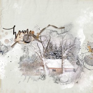
anna-aspnes-digital-art-artplay-project-template-8-ksacry Home-Challenge Day 3
My inspiration is the 12 Days of Christmas Day 3 Challenge photo (tree-5175031 Albrecht Fietz auf Pixabay). I formed the background using ArtPlay Palette Frolic Solid Paper #2, duplicated with blend mode Multiply. I clipped the photo to just the fotoblendz from page 19 of the Project Template...- ksacry
- Media item
- #anna aspnes designs #christmas #winter
- Comments: 8
- Category: Anna Aspnes
-

Comment by 'ksacry' in media 'Snow-Day-Play---Day-10.jpg'
Sounds like a fun day. I like how you have the holly as a border on the top and the bottom, kind of crazy contrasting with the block design. Wonderful!- ksacry
- Gallery comment
-

Comment by 'ksacry' in media 'anna-aspnes-digital-art -Project 2022-Joan Robillard-Extra Page 8.jpg'
I love how you have made the photo (coloring of blue) just barely peaking out around the frame. It contrasts beautifully with the dark green of the background.- ksacry
- Gallery comment
-

Comment by 'ksacry' in media 'anna-aspnes-digital-art-project-template-album-no.8-page10-michelle.jpg'
Nice mix of photos with art. I really like the OOB photo!- ksacry
- Gallery comment
-

Comment by 'ksacry' in media 'Brave'
I love your kitty photo! The layout papers you used to create the block design are perfect!- ksacry
- Gallery comment
-

Comment by 'ksacry' in media 'anna-aspnes-digital-art-project-template-album-no.8-page11-michelle.jpg'
Another nice story! I like following along with your project journey. The layout looks great with all the red/brown coloring, minimal clustering and the large title.- ksacry
- Gallery comment
-

Comment by 'ksacry' in media 'anna-aspnes-digital-art-artplay-collection-cynefin-FemaleCardinal'
I love bird pictures! You have let the photo shine in this layout.- ksacry
- Gallery comment
-

Comment by 'ksacry' in media 'anna-aspnes-digital-art-Project 2002Joan Robillard-Page 10 copy.jpg'
Another beautiful scene in your album! I thin it is wonderful that you can capture this on the way to work.- ksacry
- Gallery comment
-

Comment by 'ksacry' in media 'Wonderful-time_for-Challenge-AnnaLift.jpg'
Love your composition and the red - black - white - gold coloring. Wonderful!- ksacry
- Gallery comment
-

Comment by 'ksacry' in media 'Day 10: An Ordinary Trip'
I love your "Old Santa" faces as part of your layered paper journal!- ksacry
- Gallery comment
-

Comment by 'ksacry' in media 'Merry Christmas...'
I love the walking festive feet, So creative! You could make this a card.- ksacry
- Gallery comment
-

Comment by 'ksacry' in media 'anna-aspnes-digital-art-Project 2002Joan Robillard-Page 8.jpg'
What beautiful photos! I love how you have the muted green, blue and brown coloring with the b&w photos.- ksacry
- Gallery comment
-

Comment by 'ksacry' in media 'aAConnect Dec 9 - FEB-23-2018-HONOLULU-SUNSET-web.gif'
Beautiful! I love lighthouses and sunsets too. What a great lift from my Kalaloch layout.- ksacry
- Gallery comment
-

Laugh vrd-Dec-2022-Challenge
- ksacry
- Media item
- vicki robinson winter blues
- Comments: 3
- Category: Vicki Robinson Designs
-

anna-aspnes-digital-art-artplay-collection-verdure-ksacry Love
I got my inspiration from the 12 Days of Christmas Redo challenge. This is a re-do of a layout I did last year. Construction: I used all aAClassic Verdure Collection items. ArtPlay Palette for the foundation, Solid Paper #2, Transfers #1 & 2, Lace and Edge Overlay #1. Added the Artsy Transfers...- ksacry
- Media item
- Comments: 7
- Category: Anna Aspnes
-

Comment by 'ksacry' in media 'anna-aspnes-digital-art-project-2022-diane-PTA8-december4.jpg'
I love your "snow" all over the pages! I live north of you in Seattle area and we get several inches of snow every year. I'm so glad I'm retired and do not need to drive in it anymore.- ksacry
- Gallery comment
-

Comment by 'ksacry' in media 'Live Life'
Great Extractions! I really like your "road"!- ksacry
- Gallery comment
