Oscraps
- Credits list
-
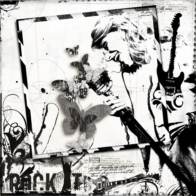
Music ValuePack No 1
https://www.oscraps.com/shop/music-01-digital-scrapbook-valuepack-anna-aspnes.html
ArtPlay Palette Rock(IT)
https://www.oscraps.com/shop/ArtPlay-Palette-Rock-IT.html
Music WordTransfers No 1
https://www.oscraps.com/shop/Music-WordTransfers-No-1.html
SkinnyLined Overlays No 2
https://www.oscraps.com/shop/SkinnyLined-Overlays-No-2.html
Torn N Tattered Flutterby Templates No 4
https://www.oscraps.com/shop/Torn-N-Tattered-Flutterby-Templates-No-4.html
- Designer(s) Used:

