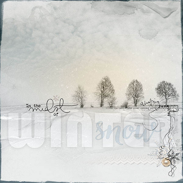
This is for this weeks AnnaLift, with the wonderful inspirations from Nias layout entitled drinking tea and meander my thoughts https://ozone.oscraps.com/forum/showthread.php?p=473095#post473095. I love the white on white in her inspiration page, so I went with that for my page.
Everything by Anna Aspnes:
Inked Words Memories No. 1 (coming soon)
ArtPlay Palette Memorable http://www.oscraps.com/shop/product.php?productid=10012135&cat=383&page=1
ArtsyStains No. 1 http://www.oscraps.com/shop/product.php?productid=10012133&cat=383&page=1
UrbanThreadz No. 7 http://www.oscraps.com/shop/product.php?productid=10011205&page=1
ArtPlay Palette Winter Sunrise (snowflake charm) http://www.oscraps.com/shop/product.php?productid=10011940&page=1
Winter WordART No. 3 http://www.oscraps.com/shop/product.php?productid=10011931&page=1
ArtPlay Palette Ocean Cove (button & lace & Artstroke) http://www.oscraps.com/shop/product.php?productid=43872&page=1
ArtPlay Palette Winter Wonderland (snowflake) http://www.oscraps.com/shop/product.php?productid=45770&page=1
Painted Overlays No. 2 http://www.oscraps.com/shop/product.php?productid=28004&page=1
ScriptTease Winter No. 1 http://www.oscraps.com/shop/product.php?productid=28350&page=1
Different Strokes No. 7 http://www.oscraps.com/shop/product.php?productid=29258&page=1
Different Strokes No. 8 http://www.oscraps.com/shop/product.php?productid=28718&page=1
ArtPlay Palette Wander (sky (desaturated)) http://www.oscraps.com/shop/product.php?productid=30500&page=1
SnowSprinklez No. 1 http://www.oscraps.com/shop/product.php?productid=46243&page=1
The Process: The photo I used was actually very blue, but I brought the color saturation way down for this layout for this weeks AnnaLift. I began with a paper from AP Memorable, and blended the photo unto the page. I used blend mode color burn. I then duplicated the photo, and played around with various other blend modes, layering the different photos, and then masked out portions of each photo to best emphasize what I wanted to highlight from the photo. To remove most of the color from the photo I used an adjustment layer, and clipped it to each photo layer. I used the adjustment layer so that I could bring down the opacity of it to allow some of the color to come back into the photo as this layout progressed. I added a number of brushes to create horizontal lines below the horizon, I decided at this point I wanted a hint of a sky, so I used a sky transfer from AP Wander and blended that into the sky area using blend mode multiply, and then again, used a black & white adjustment layer, so that I could take out most of the color, and then brought down the opacity of the transfer down to about 35%. I added the word art, and then added the large title WINTER giving it a very deep, soft, low opacity shadow, and taking down the fill of the white of the text down to just 5%, so that everything showed through. I then added the word snow, in a medium blue, but again brought the fill down to about 30%. I added the various snowflakes, and the yellow button (bringing down its saturation to barely show any yellow), along with the strip of paper lace, with its color saturation removed as well, along with the stitches. I edged it with the painted edge overlay in a medium gray to finish up the layout.
Fonts: Bauhaus 93, and VeryBerry Pro
tfl