ArtPlay Palette Downtown https://www.oscraps.com/shop/ArtPlay-Palette-Downtown.html On Sale 7/24
ArchiTextures No. 2 https://www.oscraps.com/shop/ArchiTextures-No.-2.html On Sale 7/24
Downtown WordART No. 1 https://www.oscraps.com/shop/Downtown-WordART-No.-1.html On Sale 7/24
Artsy Layered Template No. 202 https://www.oscraps.com/shop/Artsy-Layered-Template-No.-202.html On Sale 7/24
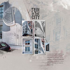
Looked at this Downtown APP and thought oh where do I go with this. I don't have a lot of city photos. So I went to my Light room Catalog and clicked on the Keyword "Portland" to look at the city photos of this city I worked in for many years. And there I saw these cool pictures of a building occupied by an architectural firm with plans painted on the facade.
Procedure
I started with ArtsyLayeredTransfer 202. I grouped two layers together to act as a mask to attach a photo together. I had exactly 5 photos to work with and carefully chose which one I wanted to use as my focal photo. I liked the one with the curve of paper where you see the name and creators of the mural. Then I attached the other 4 photos to the frames. I decided I didn't like the landscape layout of the frames so I turned them into portrait frames and arranged them in a window pane arrangement. I also enlarged them just a little. I adjusted the shadows so they matched the 120 degree look I wanted.
I turned off all the other layers of the template. I felt the page called for a simple neutral page so added Solid Paper 3. I placed transfers 3 and 7 behind the framed photo so as to add a bit of the pink and blue behind the photos which are two colors in the photos. I used a mask on both to to smooth the straight lines. To two blank layers I added ArchTexture brush 2 and Palette brush 2.
I wanted a little more texture and interest so I used transfer 3 and splatter on the page though I reduced the opacity of the transfer. Now I looked at the layers I had turned off. I only turned back on a couple of the layers. I added one of the word arts as the title and moved the location and shape of the journaling. But still wanting a little more of the pink that is in the building photo. I used two brushes to add a bit of pink. Then I added the tag to one of the frames erasing part of the string so it would appear to be going behind the photo. I also typed the word fun on the tag and tweaked the cast shadow. Now to get the journaling in the box and I am done.