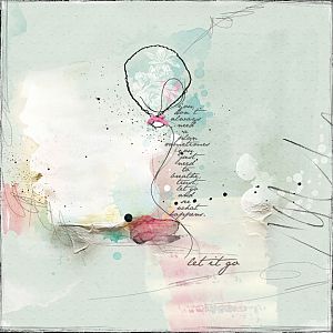
Everything by Anna Aspnes:
ArtsyTranfers Remarkable http://www.oscraps.com/shop/product.php?productid=10012501&cat=383&page=1
AnnaBlendz Artsy No. 4 http://www.oscraps.com/shop/product.php?productid=10012502&cat=383&page=1
ArtPlay Palette Remarkable http://www.oscraps.com/shop/product.php?productid=10012440&cat=383&page=1
UrbanStitchez Hearts No. 3 http://www.oscraps.com/shop/product.php?productid=10012438&cat=383&page=1
ArtPlay Palette Sparkle http://www.oscraps.com/shop/product.php?productid=46245&page=1
SkinnyLined Overlays No. 1 http://www.oscraps.com/shop/product.php?productid=29470&page=1
UrbanStitchez No. 6 http://www.oscraps.com/shop/product.php?productid=44066&page=1
UrbanThreadz No. 7 http://www.oscraps.com/shop/product.php?productid=10011205&page=1
ScriptTease Travel No. 2 http://www.oscraps.com/shop/product.php?productid=43526&page=1
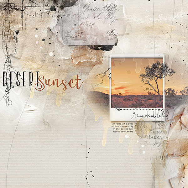
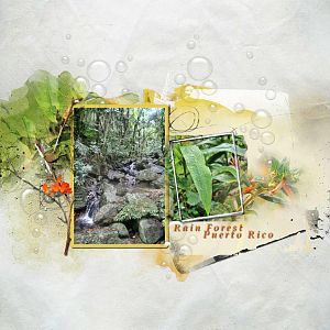
The Process: Well I really wanted to do this AnnaLift I so love Lizs layout, but I tried a number of times, just unable to come up with anything I liked. I had a much easier time after I saw the Artsy Transfers from Remarkable. They were fun to work with. I began with the background paper, that had a bit of paint texture on it. I added the polaroid frame, and attached the photo to it. I duplicated the photo, placing it under the frame, and used the inverted masking techniques http://www.oscraps.com/shop/product.php?productid=10010902&cat=422&page=1 to add portions of the photo beyond the frame. I ended up duplicating this photo layer, and placed one layer on blend mode Linear dodge, and one on Linear Burn, playing around with their opacity levels until I was satisfied with the result. I duplicated the photo one more time, and placed the tree portion above the frame layer, placing it on blend mode Pin Light. I then brought in the ArtsyTransfers, allowing some of the transfer layers to be on top of the framed photo, and modified a few colors of some of the layers to bring out the yellows and oranges of the photo. I duplicated some of the layers, dragging them to various portions of the layout for added interest. I added the skinny lined overlay, the scripttease, and stitches, and a few other transfers and brushes from AP Remarkable and AP Sparkle, and finished up with the title.
Fonts: KG Two is Better Than One, Cereal
tfl