Oscraps
- Credits list
- AnnaRelease 24 May 2019
Artplay Palette Wellspring
Artsy Transfers Wellspring
Outdoor WordART Mix 2
MultiMedia Branches 13
FotoBlendz Overlays 15
Paper Textures 15
MultiMedia Daisies 1
Process
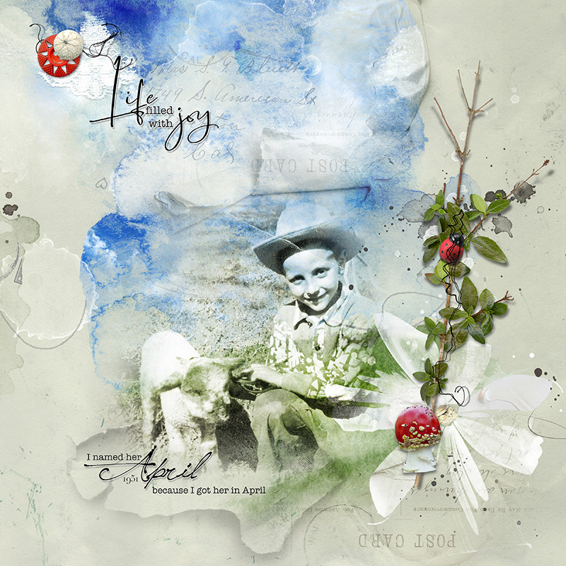
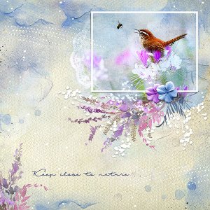
Solid paper 3 from APP Wellspring was used as the foundation of the page. Artsy paper 3 was layered above the solid paper and moved to the left. This created a greater solid workspace on the right side of the page. A layer mask was added and using the gradient tool the two papers were blended together. The photo was clipped to a fotoblendz mask. The blending mode of the photo was changed to hard light, allowing the colors of the paper to show on the photo. The paper was completed by adding some layers from AT Wellspring, multimedia elements, dimensional embellishments and word art.
Thank you for sharing!
- Designer(s) Used:
