Oscraps

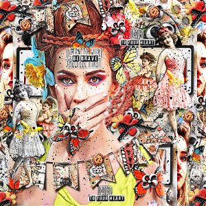
Brave Heart
Created for the March 2022 : Copycat Challenge : A Scraplift Of Britta's [AKA Rollinchen's] Gallery : Life is Like A Roller Coaster :

Link to her beautiful Layout : https://oscraps.com/community/media/life-is-like-a-roller-coaster.350599/

My Inspirations : All the bright colors,black accents & the black & white bold WA : It is also a fun! & happy layout : so I was going for the same idea...fun! bright ! & happy...
Credits list
The Scary Stuff Mixed Media Kit : Vicki Stegall Designs
Metamorphosis Butterflies : Crafty Button Design

Additional Credits :

*Font : White On Black Regular : [the WA I created : "To Your Heart" & "Be Brave"]
*Large Photo : Courtesy of Miguel Gonzalez : Unsplash [IE important to note : that the 4 largest butterflies are part of the photo & haven't been added by me ]
*Smaller Photo [placed 3 times] : Pixabay : Circa 2020
Designer(s) Used:
  1. Crafty Button Designs
  2. Vicki Stegall
  • Wow
Reactions: FiddletteDesigner
Wow! What an incredible page. The colors are gorgeous. That would have taken me days to put together!! Congrats on your well-deserved standing O! ♥
 
Wow! What an incredible page. The colors are gorgeous. That would have taken me days to put together!! Congrats on your well-deserved standing O! ♥
@Betty Jo OMG!...Thank You! So Much!!!...Feels like it took days to create this page...I started...saved...came back...So technically...I guess it did take days to create!!!...o_O...
 
This is what art journaling looks like in my head!! Any advice on how to do it?? Simply fantastic!
@pachimac Thank You! So Much for your kind interest in my work & how I create!...I'll be back later with some comments on your question... ;)...
 
Last edited:
@pachimac Thank You! So Much for your kind interest in my work & how I create!...I'll be back later with some comments on your question... ;)...
@pachimac I don't know how others approach their pages when they start a new page...but for me...generally...I start with the photo...It is [for me] one of the most important parts of any layout...I choose the photo/photos carefully depending on the subject matter/theme...They tend to be the central part of the focus in my art journaling pages...I mean the "focus"...not where it is located on the page...That also depends on the composition...Thankfully everything is changeable & movable...I often move the photo several times during the creative process...I will then choose a paper I like to again match the photo or contrast the colors in the photo...keeping in mind that once you start blending the papers together...the colors can change...so you may have to go back & reblend the photo or move it around depending on how the paper design looks...I prefer,for art journaling,papers with multiple colors & designs...Paints are a personal love of mine...Bring on the paint!!!...I also like to blend in overlays & brushes too...but that is later in the process...Once I have a paper I like & a photo...I start the blending process or start working on the photo treatment first...so blending,filters,overlays,brushes or changing the colors to go better with the paper I chose,position of the photo and /or size...[I find I often end up changing the dimensions of the photo a lot...especially the height of the person/photo...It can dramatically change how the photo can look or how much size/power you want to give the photo]...Now this can take quite some time...depending on what you are trying to achieve...I just go with my creative feelings once I begin but I do spend quite a lot of time getting the photo to some semblance of how I want it to look in the end...Once relatively satisfied...I go to the paper & start adding other papers & hit the "blend modes"...There's no perfect way to do this...You just go ahead & experiment on the different blend modes...moving the papers to different layers & see what you like best...Generally,I tend to find 2 "blends" that I like the most...Choose one & move on to the element portion of the layout...Remembering that I can always go back later & change any of the blends/or photos...Thank! goodness!...Or I would be in all kinds of trouble...

You May have noticed that I often duplicate elements or photos or perhaps frames specifically...I like using multiple frames to add dimension & depth & draw the eye in even more...It's very effective but also opens up the possibilities to add deeper/multiple meanings to a layout...3 photos of the same person in different positions/focal points or light...can symbolize me,myself & I...[I like this idea & incorporate it a lot...]...Past,present,future...3 stages of life...like childhood,middle age,older...grand daughter,daughter,mother...daughter,mother,grand mother...etc...I could go on but I think you get the idea...It also leaves the piece open to more interpretation to the person looking at it...Like how it relates to their own life...At least that is the hope on my part...

Now when it comes to elements,I have a certain symmetry to the placement of elements...They are not just randomly placed...I pick one element & place it usually 3 times or 4...I use a version of "the power of 3" technique...each element must have a symmetry to each other initially...It's just an eye thing...composition is up to the individual person...but the 3 elements should have a symmetry that fills up the space evenly between each other...does that make sense?....like if you place one element to the left of center...you are not gonna place the same element directly next to it...but more the the far right of the opposite side of the page...so they have symmetry to each other...& the third usually is way below...but maybe in the middle of the other 2...or your could do "triangle" placement points... also very effective & do this multiple times with different elements one at a time...So that way they never mess with the symmetry of the elements already placed...It is a process to learn...but it is very effective...That's pretty much how I do this...just eyeballing it takes time to learn...in the end all the elements look relatively spaced in relation to each other...if one seems now out of symmetry since you placed a new element...now just go back & move it to a more desired symmetrical place...This creative process can also be a bit time consuming to create...I often create the page in stages...but not always...it just depends on how much time I have to create said layout...but for me...I can't create any other way...mostly for the art journaling pages that is...but I often employ this technique in other styles too...even white space...

I hope I haven't bored you to tears by now explaining this to you...If I have...sorry about that...I'm never sure if people reading my explanations are understanding my way of explaining or how I see things...If you made it to the end...I really appreciate that so much...& if this helps you in your creative journey/process...Awesome!...Either way have fun creating & finding your own way to a style that you love for yourself...It's all good in the end...Create for you & how you see your pages...hearts xo Rhonda... :)...
 
Last edited:
@pachimac I don't know how others approach their pages when they start a new page...but for me...generally...I start with the photo.....

Oh my gosh - thank you for such a detailed description and taking the time to do that for me. I really like your way of doing the background. I will have to practice that. What I find I do is get a ready made blendy background and add elements on top of it. I see how the layering and blending of my own papers could really make my pages unique, because I won't be using someone else's idea of blends!!

I also choose my photo/s first. Memories are first and foremost for me, and every single one of my pages I do are personal. I like your symbolism with frames - now that I look at your page, I see that!

I am a "rule of threes" person myself. I tend to be very symmetrical in my scrapping, and with Art Journaling, I was trying to break free from that, but I find that even in the messiness that AJ can be, I appreciate symmetry and a sense of balance in my pages as well.

I don't have any of my AJ pages here at oScraps. My gallery is very thin here or I'd show you what I mean about what I do. I'll PM. you a link.
 

Layout information

Category
Challenge 1
Added by
RJMJ
Date added
View count
2,394
Comment count
28
Rating
0.00 star(s) 0 ratings

Image metadata

Filename
Challenge #1-Mar 2022-Scraplift-Brave Heart2.jpg
File size
370.6 KB
Date taken
Tue, 01 March 2022 1:57 AM
Dimensions
600px x 600px

Share this layout

Top