Oscraps
- Credits list
- Credits:
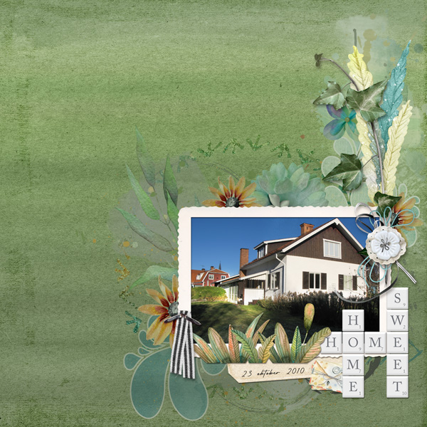
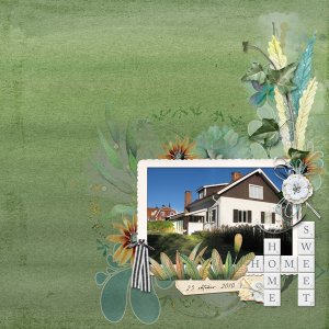
Home Sweet Home by Karen Schulz
Water Color Overlays 06 by Karen Schulz
Messy Edge 01 Gift by Karen Schulz
Font - Retro Signature
Photo: my own
Steps:
The photo was a bit dark in the foreground. I duplicated it, changed the blend mode on the top layer to Linear Dodge, and then erased the sky and houses part of that layer so that only the grass area got lighter. For the background I used a solid colored paper from the kit and one of the water color overlays. Used the solid paper as background, added a new layer on top of that, where I used the gradient fill tool and made a stripey green gradient. Then added the water color overlay on top of that and changed the color to a dark green. Changed the blend mode on the gradient layer to Hard Light and lowered the opacity to 30%. Changed the blend mode on the overlay to Multiply and lowered the opacity to 70%. Finally for the background I added the Messy Edge, changed the blend mode to Color Burn and lowered the opacity to 82%. Then I added the photo and the elements, tucking some of the painted layers under the blended layers of the background.
- Designer(s) Used:
