Oscraps
- Credits list
- Artplay Noetic Collection
FotoInspired Double Template Pack No.2U
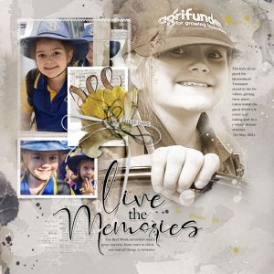
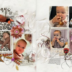
Process The background for this layout was created with three copies of the same artsy paper placed over top of each other. Page 7 of the FotoInspired Double Template Pack No.2U was placed onto the layout and some of the layers were turned off. My focal image was clipped to one of the masks which was adjusted to highlight my image. Supporting images and an artsy paper were clipped to other masks in the Template. Word Transfers, edge overlays, a transfer, paint splatters and gold leaves were placed in the background and dimensional elements were placed on top of the frames. I adjusted the colour of the pressed flower and the ribbon boy via Image>Adjustments>Hue and Saturation to coordinate with my layout. WordArt for the Title and journaling completed the page.
- Designer(s) Used:

