Oscraps
- Credits list
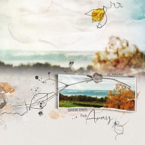
- Artplay Noetic Collection
Artplay Palette Noetic
Remember WordART 3
Urban Threadz Frames 4
Artplay Palette Embers (transfers)
Artplay MiniPalette Deciduous (leaf)
Urban Stitchez Leaves 4
Process
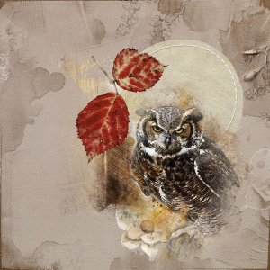
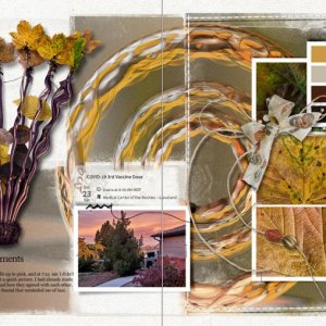
A solid paper from APP Noetic was used as the foundation of the page. The large photo was was placed on the page. A layer mask was added. Using a gradient tool the bottom hard edge was blended into the background paper. Paper textures were added along the top of the page (reduced opacity).The smaller photo was clipped to the frame mask of the Urban Threadz Frame (rotated and resized). The page was completed by adding dimensional embellishments, transfers, artstroke and splatters and word art.
Thank you for looking!
- Designer(s) Used:

