Oscraps
- Credits list
ArtPlay Palette Sojourn Anna Aspnes Designs | Digital Scrapbook Designer:Oscraps
ArchiTextures No. 4 Anna Aspnes Designs | Digital Scrapbook Designer:Oscraps
FramedMasks No. 2 Anna Aspnes Designs | Digital Scrapbook Designer:Oscraps
Sojourn WordART Mix No.1 Anna Aspnes Designs | Digital Scrapbook Designer:Oscraps
Process
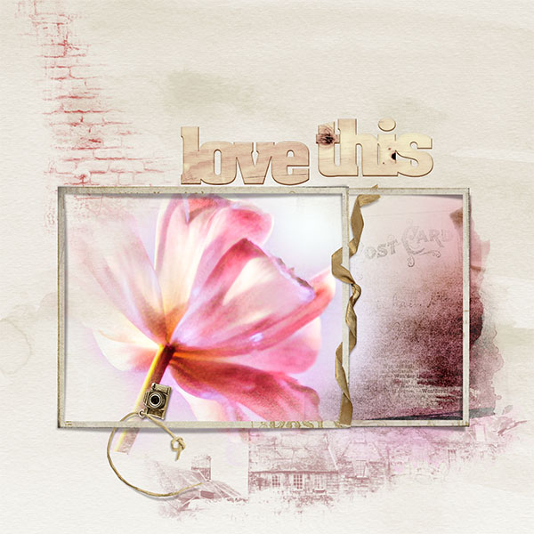
Inspiration –I took way too many pictures of my tulips which I purchased at the grocery store a couple of weeks ago. So if you have new pictures you just have to try to scrape one or two.
Start – New document
Paper – Solid paper 1 is placed over the background. I wanted a paper that wasn't going to compete with the photo.
Mask –I chose Framed Mask 1 and four. I enlarged 1 so the top and bottom edges of both frames matched up. But I grouped 1 together and added a mask to the group so I could mask out the left-hand side of the frame.
Photo –The photo I choose for my page had the tulip on the left and “white space” on the left. I edited the photo in Topaz Studio and added a Texture. I placed the photo over Mask 4 and attached using Layer>Create Clipping Mask. This allowed the flower to fill the frame. I duplicated the flower changed the Blending Mode to Multiply and attached using Layer>Create Clipping Mask. I copied the original and added the Mask 1. Moving so all you saw was the pink edge. I attached with Layer>Create Clipping Mask.
Transfer – I moved Transfer 5 over the pink and attached it with Layer>Create Clipping Mask. I added word transfer 1 over the top of the other two transfers.
Elements –I added the charm to the frame erasing on side of the string so it looked to be hanging on the frame. Then I took the ribbon and erased parts so it looked intertwined with the frame.
Brushes – I used Architecture Brush 4 and 6 on the paper picking up the color from the flower and the pink background of the photo.
Title – I used the wood words Love This for the title
- Designer(s) Used:
