Oscraps

Challenge #1 Creative Techniques
Cherylndesigns

Challenge #1 Creative Techniques

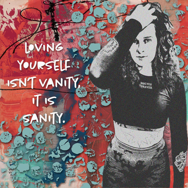
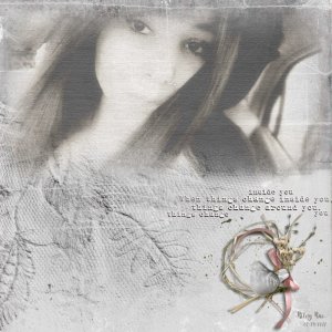
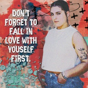
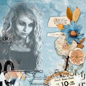
Trying this again. With a little help from a friend (you know who you are *wink* *wink*) I changed to a different image and played around with it some more. This is my oldest granddaughter. I'm still working in PSE 2023, but I tried a few different steps on this layout.
Credits list
Press Pause Handmade Background Paper by Crafty Button Designs: https://www.oscraps.com/shop/Press-Pause-HandmadeBGS.html
Press Pause Elements by Crafty Button Designs: https://www.oscraps.com/shop/Press-Pause-Elements.html
My Own Soulmate Words by Crafty Button Designs: https://www.oscraps.com/shop/My-Own-Soulmate-Words.html
My Own Soulmate Elements by Crafty Button Designs: https://www.oscraps.com/shop/My-Own-Soulmate-Elements.html
Personal photo
Designer(s) Used:
  1. Crafty Button Designs
Great take on the challenge! This photo treatment is a little "edgier" than the other one and goes well with the rest of the page.
 
Great take on the challenge! This photo treatment is a little "edgier" than the other one and goes h
Thanks, Olga. I tried to go a little "edgier" and I think the photo was edgier to start with. I loved experimenting with these techniques.
 
Exceptional page Cheryl! As Angie said above, it is a lot more edgier and that it will certainly all depend on the photo that you begin with, as you mentioned. To give your photo a good start, always use your levels to give it some contrast and you can also use one of the sharpening tools as well........ but of course, if you wanted a softer effect you wouldn't do that. :) But I am super happy that you are playing and experimenting with these techniques and the results on this page are so very awesome! Love everything about it, the colours, the extraction and grunge, and the message are all stunning!
 
Exceptional page Cheryl! As Angie said above, it is a lot more edgier and that it will certainly all depend on the photo that you begin with, as you mentioned. To give your photo a good start, always use your levels to give it some contrast and you can also use one of the sharpening tools as well........ but of course, if you wanted a softer effect you wouldn't do that. :) But I am super happy that you are playing and experimenting with these techniques and the results on this page are so very awesome! Love everything about it, the colours, the extraction and grunge, and the message are all stunning!
Thanks for all of your wonderful comments and feedback, Ona. I even attempted to work in Photoshop CC, but gave i[ and had to make do with PSE. I know there are so many more possibilities in CC, but I need to really start from scratch. Thanks for all of your hard work in the wonderful tutorials you do for us.
 

Layout information

Category
Challenge 1
Added by
Cherylndesigns
Date added
View count
219
Comment count
4
Rating
0.00 star(s) 0 ratings

Image metadata

Filename
challenge-1-creative-techniques-Ava.jpg
File size
146.2 KB
Dimensions
600px x 600px

Share this layout

Top