Antidote in Action
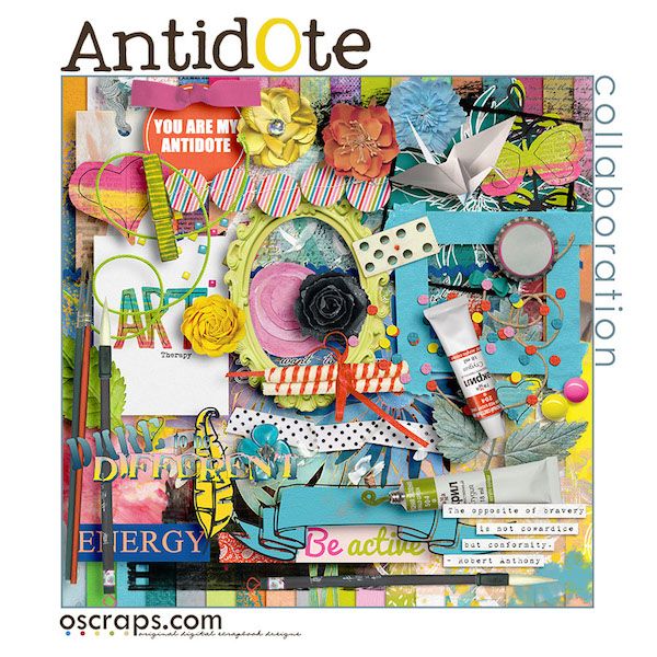
Every month, we take the time to show you one of the awesome Oscraps kits in action. This month, I am excited to be showing you Antidote, this month’s Oscraps collab, in action.
I have several layouts from the Cheery-Os to show you exactly how they used AntidOte on their pages. They really show off the versatility of this kit.
This first page is from margje.

Here is what margje had to say about her process for creating this beautiful page. “I did a photo treatment with the photoshop filters and the blending modes. I clipped my photo a on the mask. I recolored the frame to white and placed it under the photo. I placed the background paper and blended it with the with layer under it to make it a bit lighter. Added the gesso and the paint and gave it a gaussian blur. Recolored the text to white and added it. Placed the embellishments. Added some paint over the flowers embellishments and blended it with color burn blending mode.”
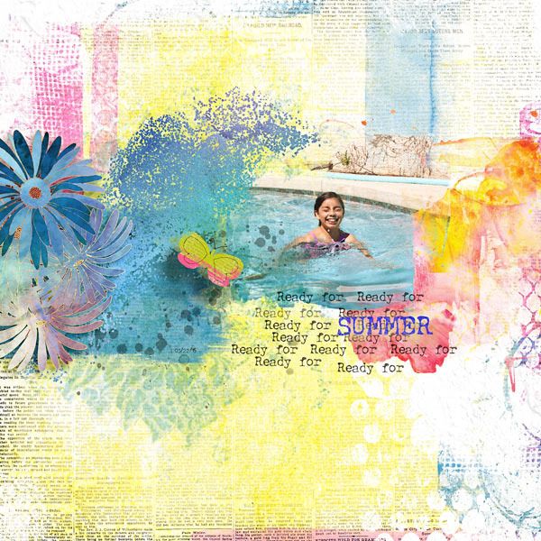
Next up is this wonderfully colorful page from Flor.

Here is some information from Flor about her creative process for this fun page. “Summer pages are always fun for me. I love this colorful kit. I didn’t want any frames. I blended the background paper using a screen type layer. I took the different paint mask around my photo. I gave dimension using shadows to the flowers and the butterfly. For my title I enter a text ready and I use a clipping mask using brushes to give some texture and I also played with the opacity.”
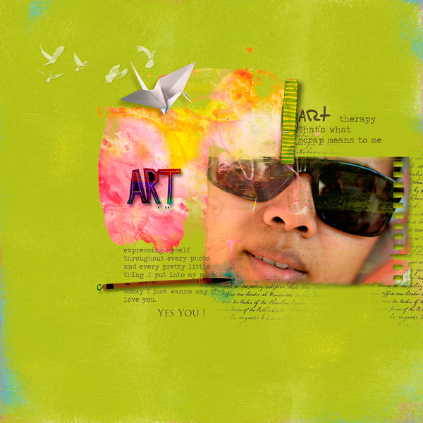
Then we have this wonderful page from Dina with a great art feel to it.

This is what Dina had to share about her process for this page. “I wanted colors, joyful and dynamic colors. The green paper was perfect, the orange brush also. Then a non standard frame for my photo, so I take one of the brushes. In my mind, an art must be more manual, that’s why I put the handwriting element. Everything put everywhere like a little mess..”
Now we have this beautiful page from marijke.

Marijke had this to share about her creative process. “I decided to use one of my pictures from an art project I ‘ve visited. I choose the photo with the pig that’s working in an office.
I started with one of the background papers … placed my photo on a clipping mask. I recolored the frame. Behind the mask with the photo, I placed some brushes and reduced the opacity of them.
I took the wordart from one of the journaling cards. Duplicated the words and I used two different blending modes: darken and color burn. I finished with two elements.
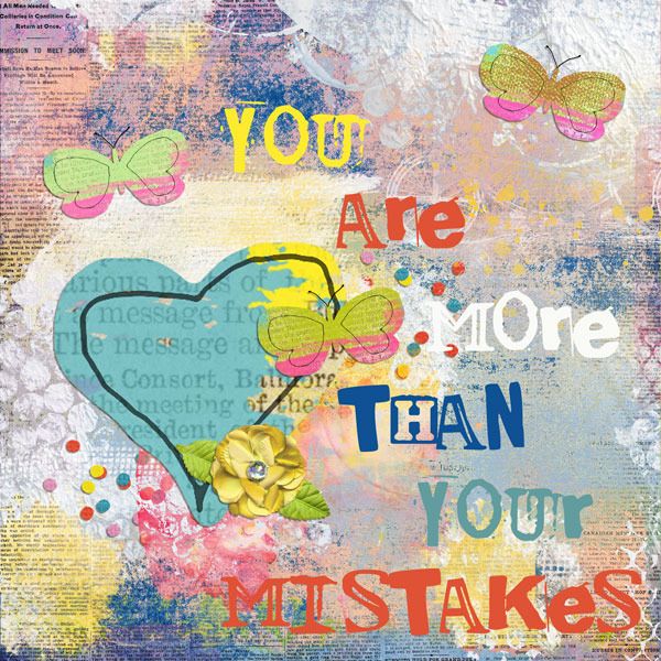
Finally, we have this digital art journaling page from Cindy.

Here is what Cindy had to say about her creative process. “I’ve been wanting to do an art journal page stating “you are more than your mistakes” since I heard the phrase on the radio a few weeks ago. The colors in the Antidote kit seemed perfect for the phrase.
I created the background by layering four papers. The bottom paper is in normal mode I used the Lighten blend mode on one and the Lighter Color blend mode on a second. For the third paper, I used a black mask to hide the paper and then used brushes to reveal portions of the paper. After finishing with the papers, I added some additional paint from the kit to add more texture. I then added the several elements to the page, duplicating the butterfly twice and then recoloring it slightly to add more interest to the page.”
Now that you’ve had a chance to see AntidOte in action, head on over to store and check out this amazing kit.
