Font Doc Returns! – Subway Art
Hi everyone! It’s been awhile since I’ve posted thanks to some crazy classes I am taking. But I’m back for a little bit and wanted to talk with you about something that is popular right now that relies a lot on working with fonts – Subway Art!
For Christmas, I got the chance to make a subway art present for the first time and I am guessing, it won’t be my last! In making the present, I studied a lot of different samples and realized that you need to make several font choices along the way. Here’s the finished product I made.

(Pardon the off-centeredness of it, it was my first attempt ever!!)
If you’ve been thinking of trying this technique, here are some things that you will need to decide.
1 – Quotation, topic phrases, or simple words? The first thing you need to decide is if you are going to use an entire quotation, blocks of words like my porch rules, or just plain words that fit your topic. This will also help you decide how many fonts and colors to use, as well as how to space out your lettering.
2 – Do you want to use all the same font or different fonts? In the canvas art I made, I used all the same font, a block, san-serif font that would be easy to read and work with on the canvas. But in my header above, I mixed fonts. One allows for more visual interest, but the other creates a clean, classic look that also allows you to focus on the words.
3 – Script, block, or mixed? I’ve written about this topic before, but the style of font you choose should echo the feeling you are conveying with your words. Are you going for a formal feeling where a classic serifed block font would work? Do you want a more fun, casual feeling? Or something more whimsical with mixed-fonts like the header up top?
4 – Color? Most subway art tends to be fairly simplistic in color. Either a monochromatic approach or a single color contrasting against the background. Adding too many colors, especially if you are using many different fonts, could be visually overwhelming. But if it’s done right, it can create an even more fun look. I would suggest sticking to one color if it’s a single statement that you are making (like my porch rules) and simply accenting important words if you want more color, but if you are typing different ideas, color contrast across the statements can help separate them. Check out the two examples below and click on the link to take you to their original sources.
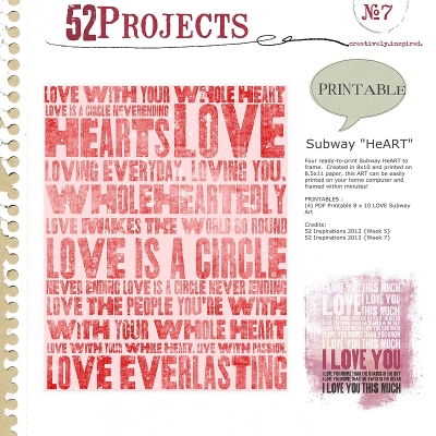
5 – Spacing? Probably the last thing you need to choose is if you want simple spacing of block lines or if you want to vary it. For my canvas art, I simply had straight lines of text and adjusted the font size so that the words took up the whole line. But consider creating spots where one line of text bumps against two – like “pool” does with “time to play” and “sandals”. Or how Sue Cummings created a bit more visual interest by breaking up the top lines of this word art. You’ll also want to decide if you want your lines to each have their own space or if you are going to overlap them.
Once you have decided all those things, it’s time to start playing!! Start by making one line of text and then duplicating the text box several times. If you are going for a straight line look like my canvas art, one large text box will do. But if you are going to use different fonts and break up your spacing, you will want a text box for each phrase or word. If you have a font program, like Font Book on Macs, that will help you preview your fonts easily, keep that open in a separate window. That way you can compare the fonts you already have going on your layout with other ones you may want to add. Don’t be afraid to move things around and change fonts.
In the end, you’ll have a wonderful piece of artwork that is both fun and stylish! If you have any other tips for Subway Art or have created some yourself, I’d love to hear it in the comments. Have fun creating!!


Love your porch rules, great piece of subway art!
great article and lots of things to think about . Love those chalkboard fonts- thanks for linking us up.
Does this mean there will be a challenge about this in the near future??
very cool! I always love subway art and try and try to do it, but kinda struggled with it. I’m gonna try it again after reading this!
This is super! Thank you!
Sara the Font Enabler, fantastic tips (and fonts!!)