Friday’s Standout: Exploring the Top 10 Pages of the Week!
Hello, dear readers! Are you all geared up for another exciting journey through the ten standout pages in our gallery this week? February has been a whirlwind of activity, perhaps compensating for the lengthy January we endured – but hey, we made it to the last Friday of the month!
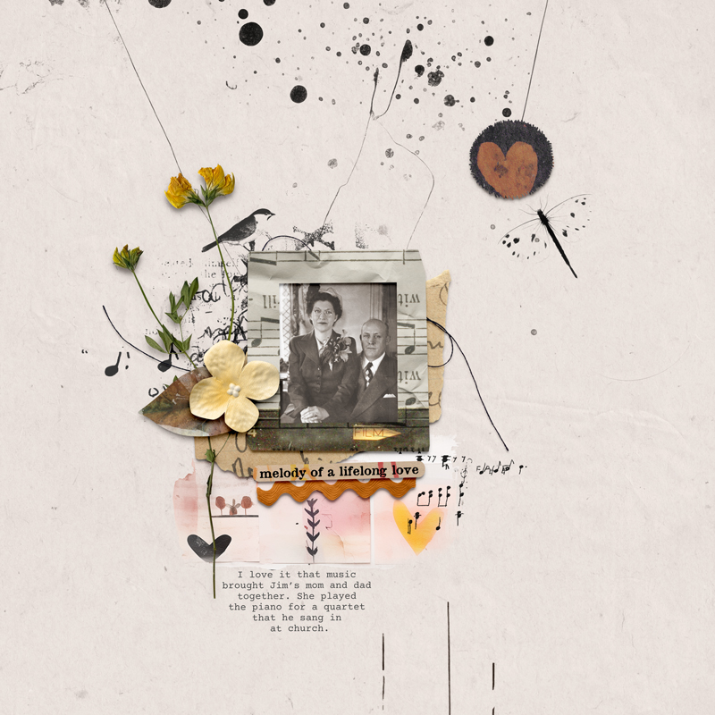
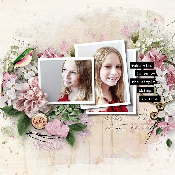
Let’s kick things off with this stunning page created by Ona. I absolutely adore the delicacy of the flowers, and the photo captures a beautiful moment.
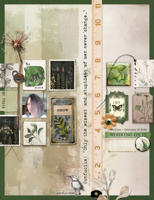
I’m a fan of pages that evoke a vintage aesthetic like this one. The subtle shadows and centralized layout really add to its charm.
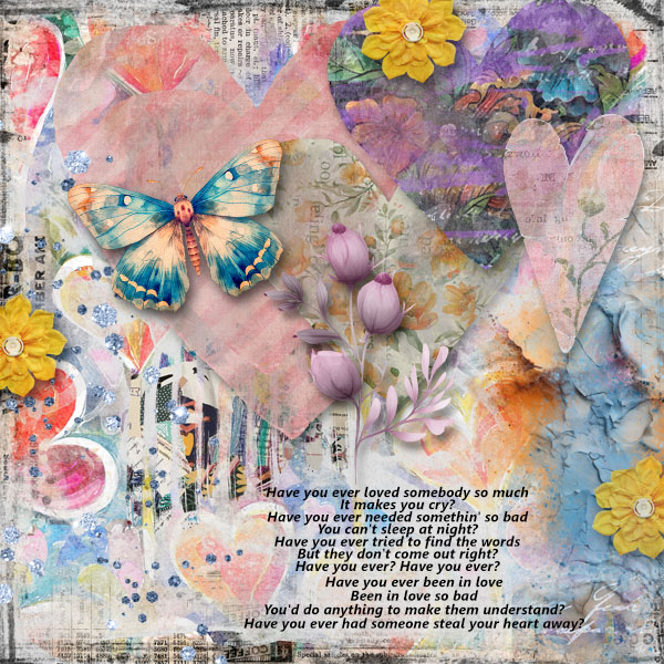
We’re enchanted by the array of colors on this page. Despite the absence of a photo, the captivating background design steals the show with its stunning beauty.
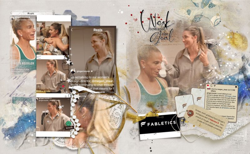
Here we have an inspiring double page spread. I love the way the photos are organized to perfectly capture that special moment.
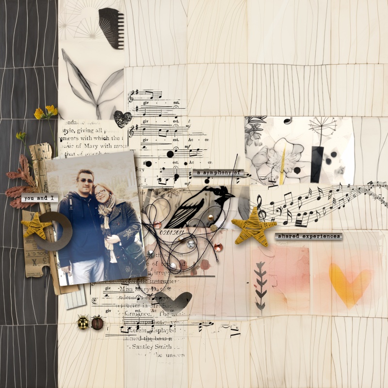
A delicately musical page indeed! I admire the gradient used in the photo, which beautifully creates that creased photo effect.
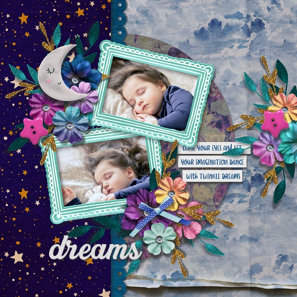
There’s nothing sweeter than witnessing the peaceful sleep of a carefree child. This page truly captures that serene moment perfectly. I’m particularly fond of the layers of papers and the well-crafted clusters—it adds depth and charm to the layout.
I adore the accent colors on this page; they really bring it to life! The rectangular format of the layout adds a sophisticated touch, making it stand out even more.
Bring on spring! I’m absolutely captivated by the refreshing colors in this photo, and the layout is truly impeccable.
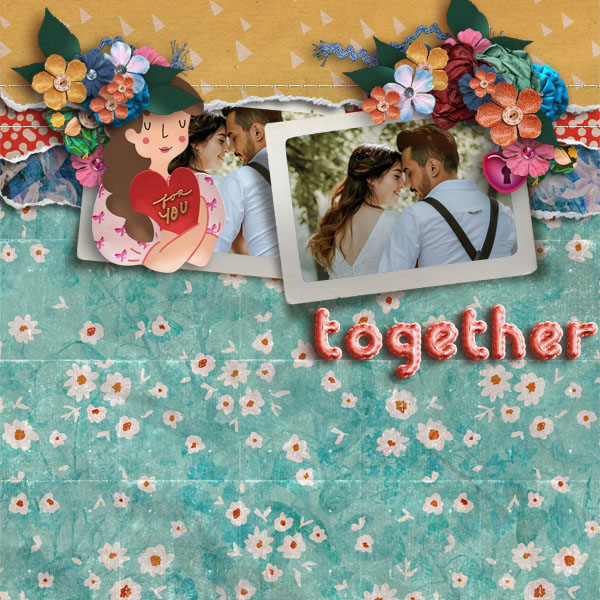
Wow! I’m absolutely enchanted by the layout at the top of this page. The way the flowers seamlessly integrate with the doll’s hair is simply delightful.
Finally, we have this page boasting an impeccable minimalist design. I’m drawn to the concentration of elements in the center, creating a striking focal point. Additionally, the perfectly balanced shadows add just the right touch, enhancing the overall aesthetic.
Without further ado, let’s dive into the inspiration brought by this week’s handpicked pages.
I trust you enjoyed this curated selection and that it ignites your creative spark as you explore the latest releases this week.
Until next time!
hugs,
Kel

