tanteva
Mistress of Mayhem
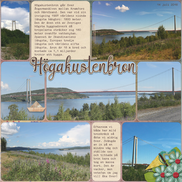
I've gotten a couple of comments on my layout Högakustenbron and I thought I should write something about it. Especially, since this month's theme is photos. First of all, here's the layout so that you know what I'm talking about:
I've had a few comments on how great my panorama photo looks and how cool it is that I've split it into three photos like that.
BUT - it's not a panorama photo. I don't have that feature on my camera. This is the beauty of using a grid template when scrapping. I have used 3 different photos and created the illusion of one long panoramic view of the bridge. If you look closely on the road and the land behind the bridge, you can see that they don't line up perfectly, but since the bridge is the focal point, and as long as it line up - this create the illusion of one panoramic view.
Have you used grid templates to fool the eye?
Or have you scrapped an actual panorama photo?
Or maybe you have photos you can use together with a grid template and use this "cheat" to make a panorama layout?
Please share - I'd love to see it!
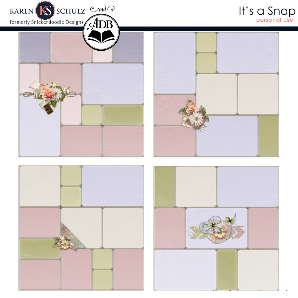
Here's the template I used - it has a "plastic" bottom and top layer that gives an effect of an actual photo pocket page, and really helps to fool the eye a bit.


