Oscraps

November Challenge #5 - Creative Photo Treatments

svanderhaegen

Well-Known Member
CHEERY O
1730337719884.png
All members that participate, PLEASE ensure that you read all the rules for this challenge
so that you can claim your challenge points. Thank you!

NOTE: This is a photoshop only tutorial.
I am sure the same effect can be achieved in Corel Paint Shop pro and other programs,
using a motion blur effect.

Here's a step-by-step guide for creating the Adamski Effect in Photoshop, which creates an abstract, painterly style often seen in landscape photography:

Step 1: Open Your Image
1. Open your chosen image in Photoshop.
2. Duplicate the Background Layer** by pressing `Ctrl + J` (Windows) or `Cmd + J` (Mac). Name this layer "blurred effect"
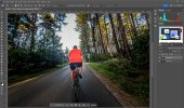
3. Select your subject wit the Object Selection Tool (W) Draw a rectangle around the object, and Photoshop will try to select it. With the selection active, press Ctrl + J (Windows) or Cmd + J (Mac). This will create a new layer with just the selected object. Name this layer"subject"
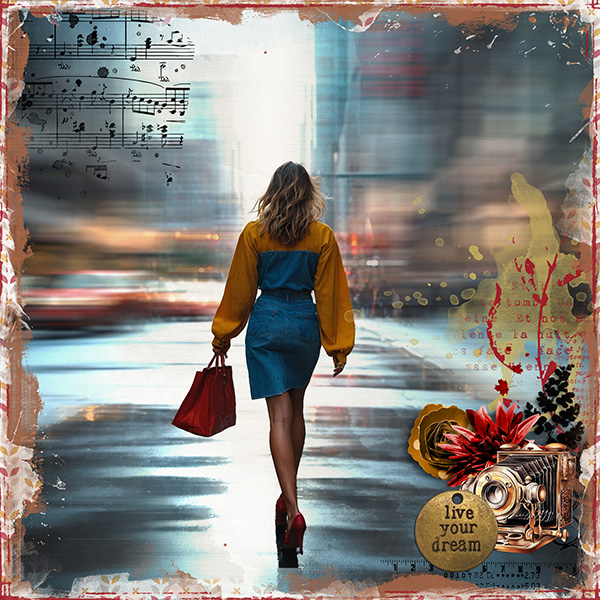
wake up happy 2.jpg
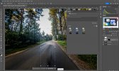
Keep your selection active and go back to the layer "blurred effect" and use generative fill to fill the selection. This way you get a layer without the subject on it.
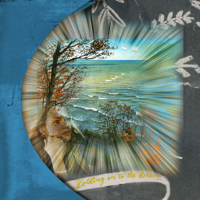
002.jpg
Merge the generative fill layer with the blurred effect layer.

Step 2: Apply Motion Blur
1. Select the layer "blurred effect"
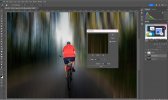
2. Go to Filter > Blur > Motion Blur.
3. Adjust the Angle to match the direction you want to emphasize (commonly horizontal or vertical).
4. Set the Distance between 200-600 pixels (adjust to your preference).
5. Click OK to apply the blur.
003.jpg

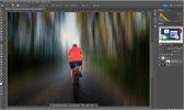
Step 3: Mask the Blur Effect
1. With the "blurred effect" layer selected**, click the Layer Mask icon at the bottom of the Layers panel.
2. Select the Brush Tool (B), and set the brush to a soft round brush with a low opacity (20-40%).
3. Paint on the mask to reveal areas of the original image you want to keep sharp. For instance, in landscape photography, you might want to reveal some details of trees, mountains, or other main elements.
004.jpg

Step 4: Adjust Layer Opacity and Blend Mode (Optional)
1. Adjust the **Opacity** of the blurred layers to fine-tune the effect.
2. You can also experiment with Blend Modes like Soft Light or Overlay for a more integrated look.


Step 5: Fine-Tune the Overall Image
1. Make any additional color adjustments using Adjustment Layers (like Curves or Hue/Saturation).
2. Add a vignette if desired by going to Filter > Lens Correction and selecting Vignette under the Custom tab.
3. Add an overlay if desired (I opted for a spooky overlay)
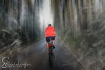
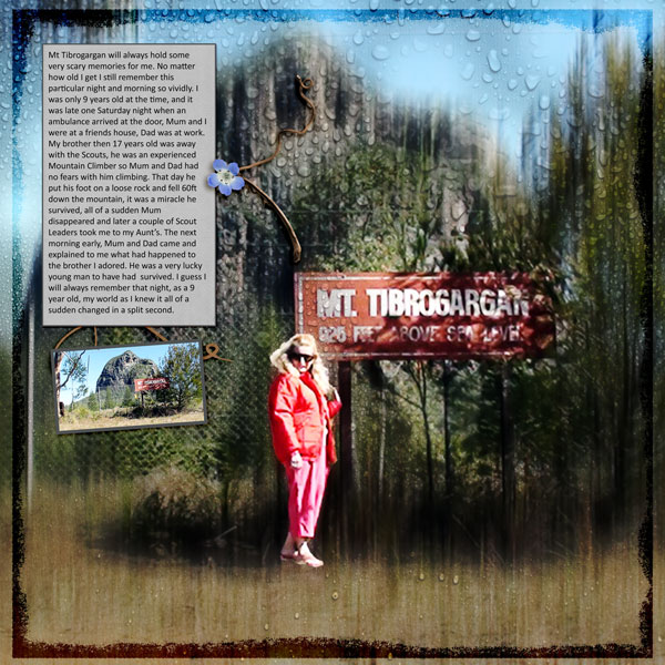
2024-08-11 19.30.12-b.jpg

Step 6: Finalize and Save
1. Review your work, adjust any masks as needed, and flatten the image when you’re satisfied.
2. Save your file as a PSD if you want to keep the layers, or export it as a JPEG for web or print.

This effect can be customized greatly by adjusting the blur distance, angle, and layer opacity, so feel free to experiment to get the look you like!

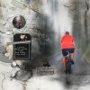
and ofcourse, than you make a layout with it!!
20240811.jpg

RULES:
- Use the tutorial steps above to change your photo. For non-Photoshop users use some type of motion blur filter on your photo and let me know what you did, here in the thread when you post your layout.

- Please use 80% Oscraps products that are currently in the store.
- Non-Oscraps products or retired O designer products can be used whether the designer is selling elsewhere or not.
- You need to credit all the products used on your layout.
- Your layout can not be used for more than one challenge.
- Your page must be posted in the Challenge 5 gallery by midnight PST november 30th, 2024 and linked back to this thread (see below on how to add your linked layout).
- And do not forget to update the CURRENT MONTH'S TRACKING THREAD to be eligible for your coupon.

Adding a linked layout from the Gallery to a thread:
1. Upload your layout to the gallery first. In your forum post click the Gallery Embed icon (little camera).
2. This will open your gallery, simply click on the layout you require, then scroll down to the bottom of the screen and click the Continue button.
3. Your linked layout is now in your post, the image will appear once you have clicked the Post Reply button.


Attachments

  • 005.jpg
    005.jpg
    148.4 KB · Views: 8
Last edited by a moderator:
Terri M

Well-Known Member
Same. Not at my computer now so I’ll have to look at the menus. The generative fill…. Google photos does a good job of removing items, and PSE guided mode has a remove item option, so that may work, depending on the photo chosen. Since we’ll be putting the unblurred item back over the same place it might not matter how good the generated fill is.
 

Terri M

Well-Known Member
PSE does have the motion blur filter, so I think this is doable. I'm going to give it a shot!
Yes, it does. I used the "remove object" option in Guided mode, then played around with re-ordering the layers that it created, then did the selection of the main subject to put it on its own layer, and was able to follow the rest of the steps. I didn't keep a good record of what I did, but, yes, it's doable.
 

BoatLady

Well-Known Member
Here is my attempt-PSE2021
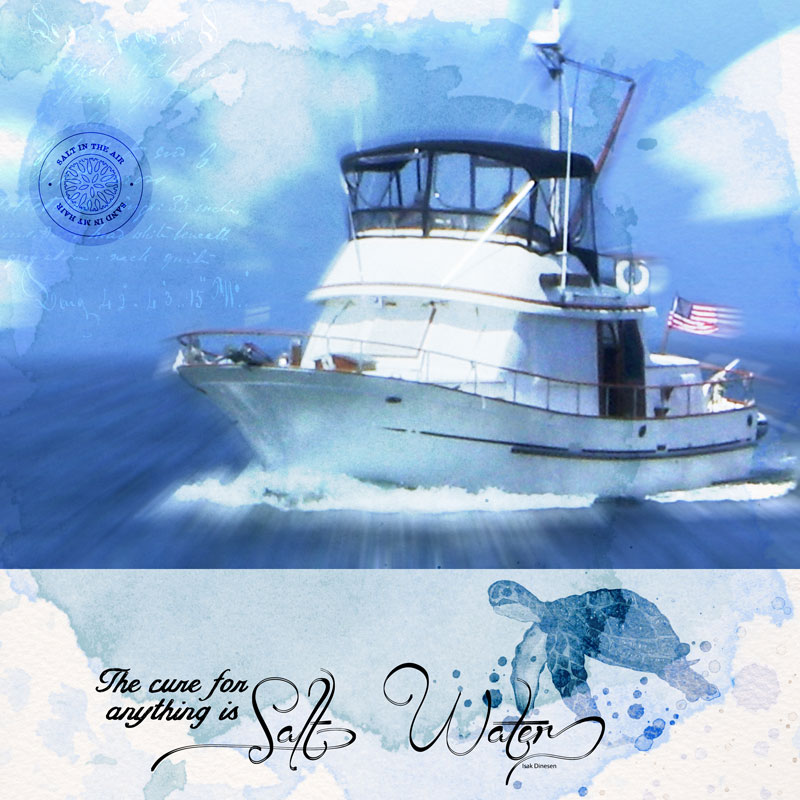
First I added some clouds because the sky was boring. I cut out the boat then copy/paste. On lower layer in the "guided" section I used Fun Edits- zoom burst effects to create motion. Merged those layers. I blended them into the watercolor background with hard light mode. I blended the turtle with blend mode overlay then made the rest of the page like normal.

I hope this is what it is supposed to look.


svanderhaegen

Well-Known Member
CHEERY O
Same. Not at my computer now so I’ll have to look at the menus. The generative fill…. Google photos does a good job of removing items, and PSE guided mode has a remove item option, so that may work, depending on the photo chosen. Since we’ll be putting the unblurred item back over the same place it might not matter how good the generated fill is.
it doesn't really matter that much indeed. It's more to create a more consistent blur. If I wouldn't have removed my husband on the background, I'd have a blurred red spot in the background,which just doesn't look that great
 

zanthia

Well-Known Member
CHEERY O
interesting effect, even pse 10 has radial blur and motion blur but you would have to manually extract the subject
 

Belle

Well-Known Member
I don't know if I'm explaining this correctly. First select your photo and go to the Edit Menu-Define Pattern. Blur your photo in any way you prefer, then brush in the pattern.
Maybe one of the gurus can explain it properly. I just know I've done it before but would have to go play around with this method again.
 

isDK

Well-Known Member
Thanks for the challenge, Sonja!
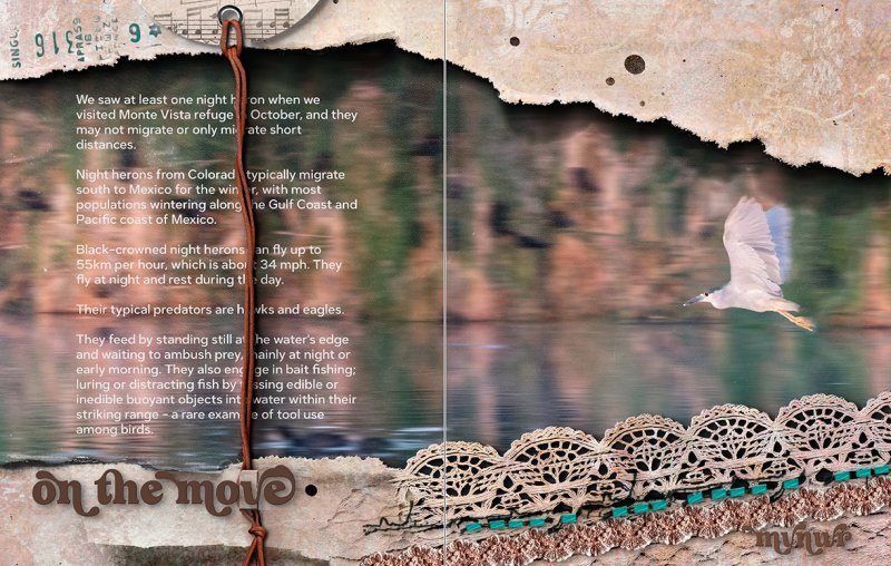
I would never choose a photo with background blur when I paid more for the high speed features, and wouldn't want to purposely blur those wonderful blackbirds and the mama coot and her baby. I had to go back to August and I had already used this photo on this page, https://oscraps.com/community/media/sounds-of-nature.397146/ but I didn't have that heron front and center, so it was OK to add this page after that one. So I got 'er done eventually. :p


FloridaGranny

Well-Known Member
Thanks, Sonja, for teaching us an interesting technique. Like @Terri M I thought finding a good photo was the hardest part. This was the best of what I could find.
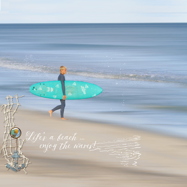
In my PSE24 I went to Layer>Select>Subject to remove the subject. Then, back to the original photo, I went to Layer>Select>Background to get the ocean and beach which I blurred.


svanderhaegen

Well-Known Member
CHEERY O
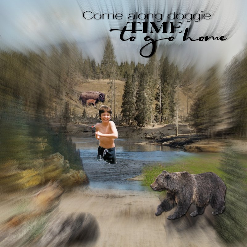
I use Scrapbook Max for scrapping I saved the background, then edited in Picasa to add the blur/zoom effect. Then I added the bear and my nephew.
Just a gentle reminder: In order to be eligible for a coupon, please make sure to post your page in the Challenge 5 gallery. Looking forward to seeing your submission!
 

svanderhaegen

Well-Known Member
CHEERY O
Thanks for the challenge, Sonja!
I would never choose a photo with background blur when I paid more for the high speed features, and wouldn't want to purposely blur those wonderful blackbirds and the mama coot and her baby. I had to go back to August and I had already used this photo on this page, https://oscraps.com/community/media/sounds-of-nature.397146/ but I didn't have that heron front and center, so it was OK to add this page after that one. So I got 'er done eventually. :p

Just a gentle reminder: In order to be eligible for a coupon, please make sure to post your page in the Challenge 5 gallery. Looking forward to seeing your submission!
 

isDK

Well-Known Member
Just a gentle reminder: In order to be eligible for a coupon, please make sure to post your page in the Challenge 5 gallery. Looking forward to seeing your submission!
Thanks SO much for helping me get my page into the right gallery. I worked so hard on that page my brain was fried, and I totally forgot to post it in the right gallery, even though I tagged it #5 to make sure it got there. :heartpumppink:
 

Bubby

Member
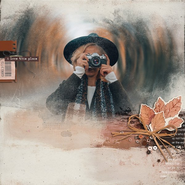
Thank you for the challenge, I hope I got it a least a little right, the trick was finding the right photo this was the best I could come up with. One overlay – my stash – border – mine - other items - Meadow Song – Palvinka Designs - Photo – mine – font – Calbri
 

mary-lynne

Well-Known Member
Thanks for the tutorial. I didn't get much of the motion sense, but I was blown away at how well it "cleaned up" the background. So cool. See original photo attached


DSC01299-motion-blur.jpg
 

NAdams

aA Creative Team Member


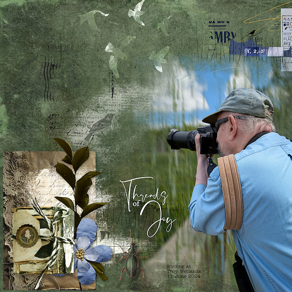
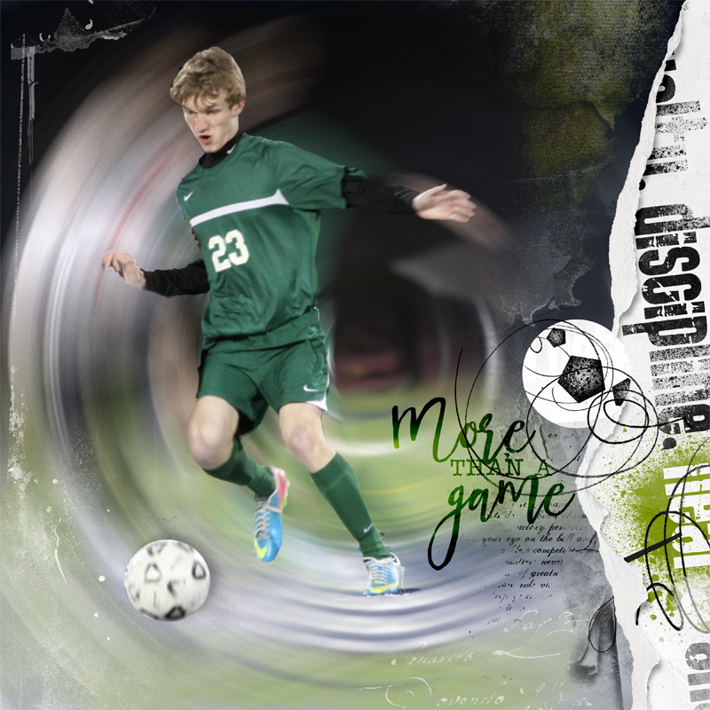
I use PSE 14. I extracted the figure to a separate layer. The photo layer was duplicated. I used the radial motion blur. I tried the blending modes. Although I like the second figure which I revealed with a mask, I left him blurred out.

Thank you for the challenge!
 
Last edited:
Top