All members that participate,
can everyone PLEASE ensure that you read all the rules for this challenge
so that you can claim your challenge points. Thank you!
I hope you are having a great summer and are enjoying our july challenges.
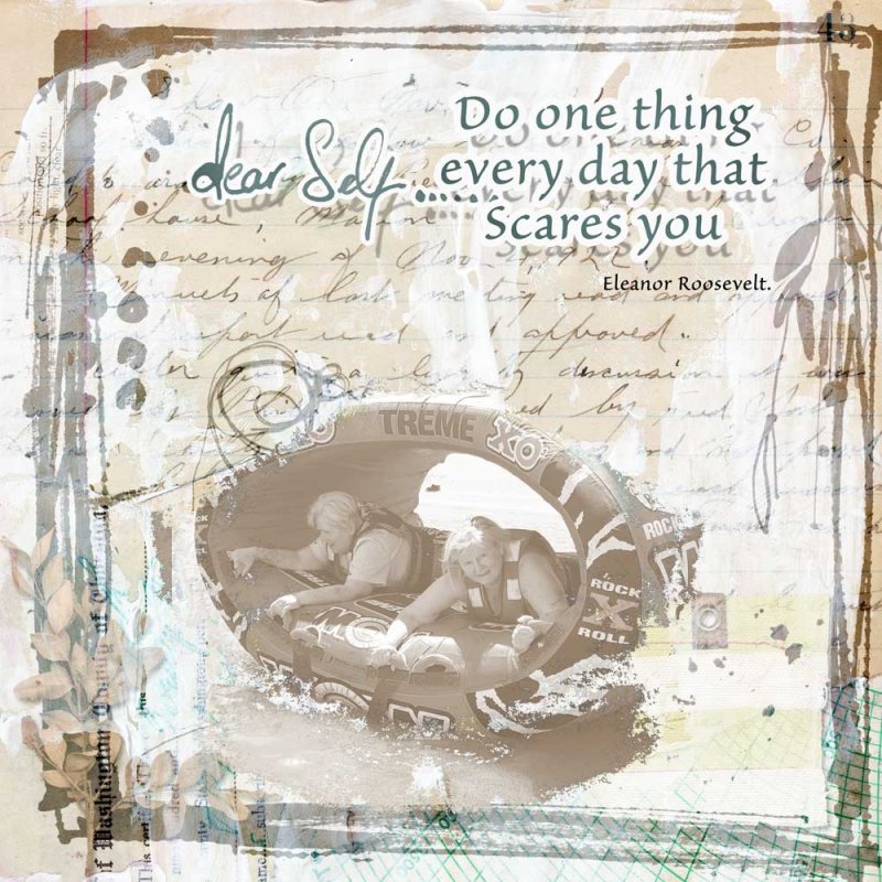
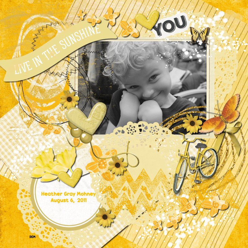
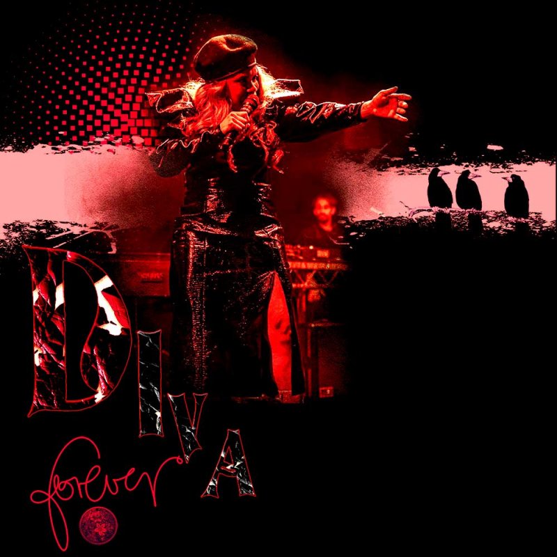
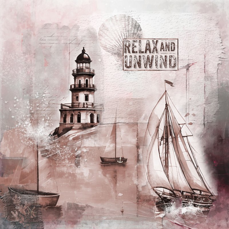
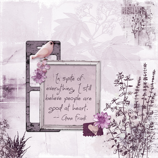
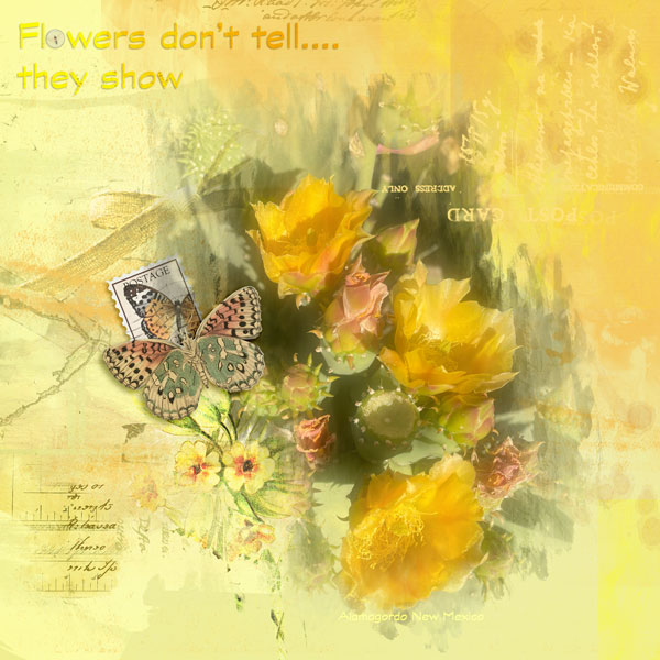
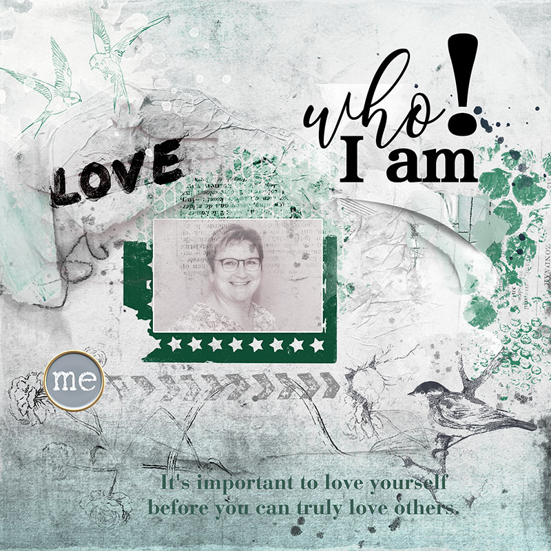
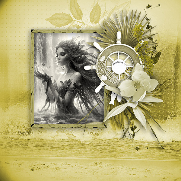
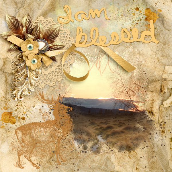
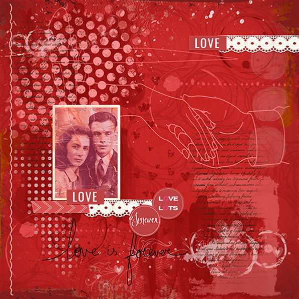
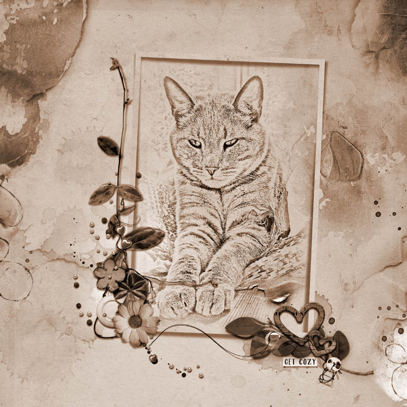
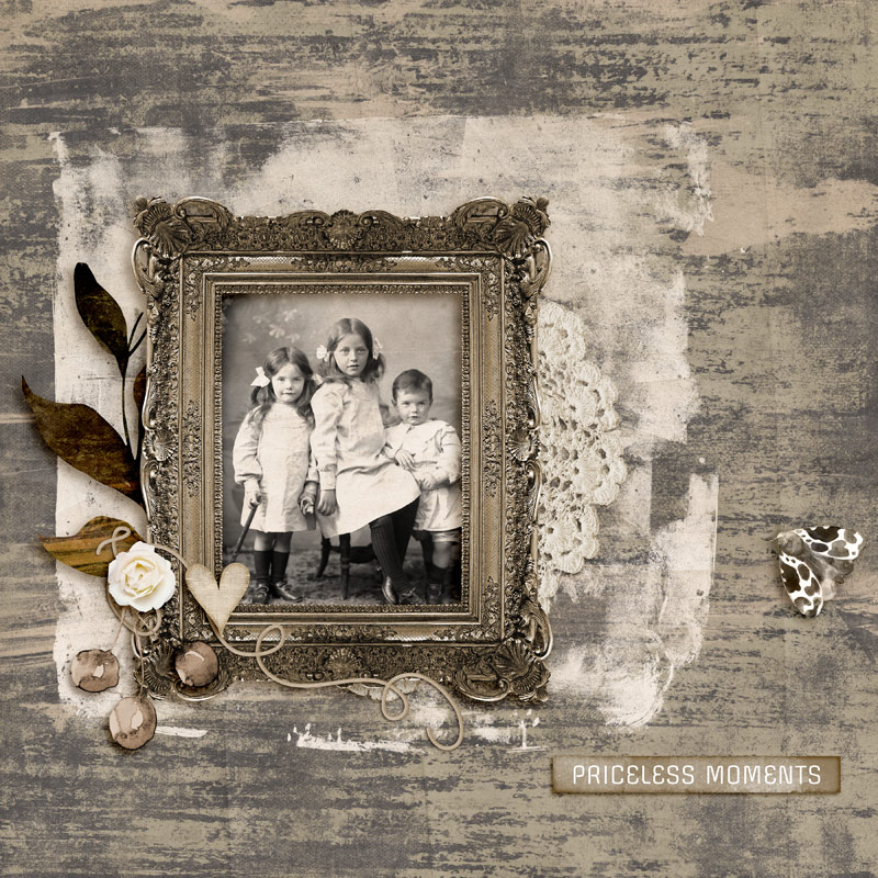
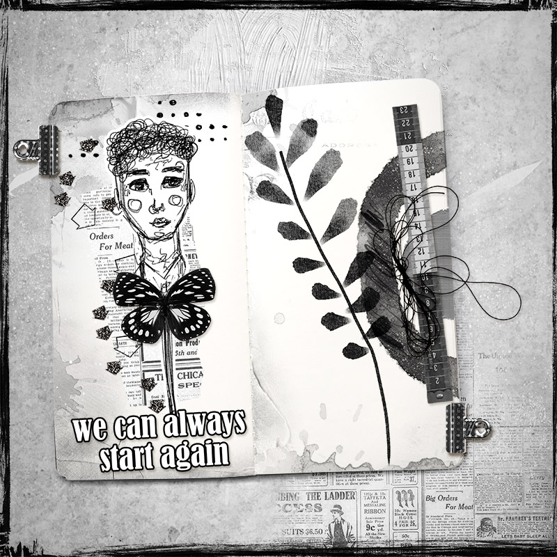
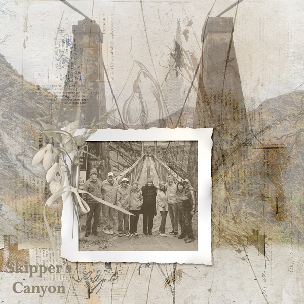
As a general rule of thumb, a Mixed Media page is created with a variety of mixed mediums such as gesso, paint (splatters, strokes, blobs, splats), stamps, stencils etc. What makes this type of page stand out is also the use of texture. This month, for the Artsy/Mixed media challenge, we are exploring a Monochromatic Colour Scheme.
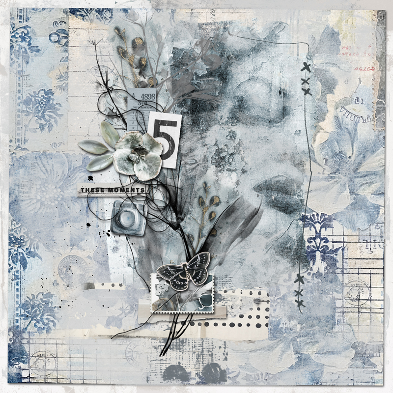
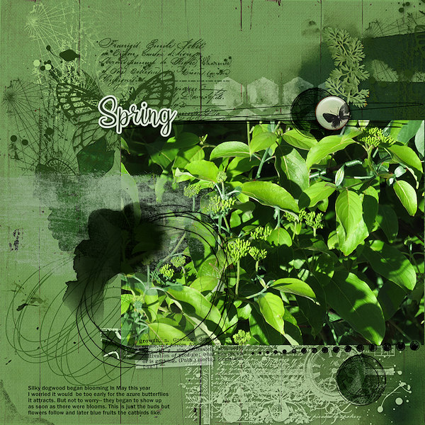
A monochromatic (or monotone) colour scheme involves using only one colour (or hue). By adding black, you create darker tones of this colour, and by adding white, you create lighter tints. This creates a harmonious and cohesive look on your scrapbook page.
Challenge Details:
The challenge is to create an artsy digital scrapbook page using a monochromatic colour scheme. Go wild with gesso, paint, stamps etc, but restrict yourself to one color. You are allowed to use a black and white picture, no color picture though.
Here's how to get started:
1. Choose Your Main Colour
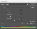
- Open your digital design software and set your colour picker to HSL mode.
- Select your main colour from the H (Hue) slider.
2. Create Your Monochromatic Palette
- Use the L (Lightness) slider to adjust your colour, creating various tints (lighter) and tones (darker) of your chosen hue. White and black are also allowed on your pages.
3. Design Your Scrapbook Page
- Using your monochromatic palette, design a scrapbook page. You can incorporate photos, digital elements, textures, and text, all within the same colour family. The only exception is your picture, which can be Black and White.
- Experiment with different shades and intensities to add depth and interest to your page.
4. Add Creative Elements
- Think about how to use contrast within your chosen colour. Dark tones can create shadows or frames, while light tints can highlight key elements.
Add patterns or textures that complement your monochromatic scheme.
Tips for Success:
- Ensure there's a good mix of tones and tints to keep the page visually interesting.
- A monochromatic scheme can draw attention to the details and emotions in your photos and journaling.
- Use these to add dimension and variety without introducing new colours.
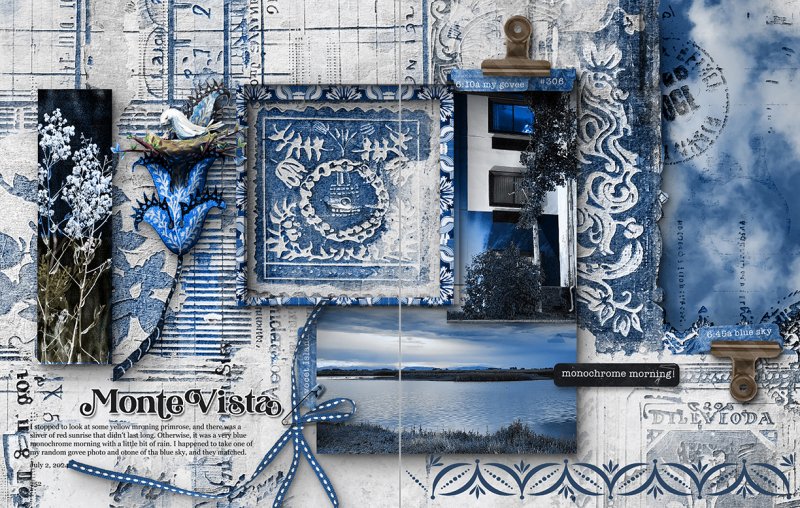
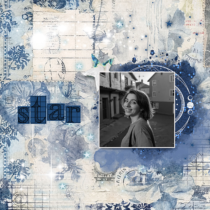
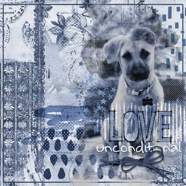
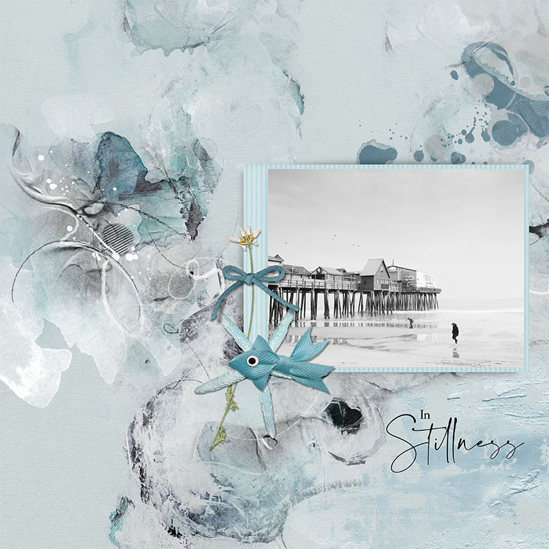
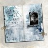
As you can see, I went for blue.
I used the "June Feeling" kit by CarolW designs
RULES:
- Create a mixed media page using a monochromatic color scheme.
- Please use 80% Oscraps products that are currently in the store.
- Non-Oscraps products or retired O designer products can be used whether the designer is selling elsewhere or not.
- You need to credit all the products used on your layout.
- Your layout can not be used for more than one challenge.
- Your page must be posted in the Challenge 4 gallery by midnight PST July 31st 2024 and linked back to this thread (see below on how to add your linked layout).
- And do not forget to update the CURRENT MONTH'S TRACKING THREAD to be eligible for your coupon.
Adding a linked layout from the Gallery to a thread:
1. Upload your layout to the gallery first. In your forum post click the Gallery Embed icon (little camera).
2. This will open your gallery, simply click on the layout you require, then scroll down to the bottom of the screen and click the Continue button.
3. Your linked layout is now in your post, the image will appear once you have clicked the Post Reply button.
Last edited:
