Oscraps
Search results
-

Comment by 'Jam-on-toast' in media 'Good Times'
Christa, I love EVERYTHING about this page - the torn frame, the way you placed your elements rather than created a cluster, the colors and that is it a vintage page...- Jam-on-toast
- Gallery comment
-

Comment by 'Jam-on-toast' in media 'BE - Celebrating Women'
Gorgeous border! And I love your text on a path element!- Jam-on-toast
- Gallery comment
-

Comment by 'Jam-on-toast' in media 'PACE OF NATURE'
Ona, this is gorgeous! Your page feels like nature itself! Love all these photos of your potted plants. A shed like this is my dream!- Jam-on-toast
- Gallery comment
-

Comment by 'Jam-on-toast' in media 'Very little is needed'
I can almsot smell crisp fresh air coming from your page! Your layout makes me want to go outside and take a deep breath!- Jam-on-toast
- Gallery comment
-

Comment by 'Jam-on-toast' in media 'Mothers are...'
LOVE LOVE LOVE the wayyou built your background with additional papers! great shadows too! And I adore your clustering - all three are so similar yet not the same. Awesome work all around.- Jam-on-toast
- Gallery comment
-

Comment by 'Jam-on-toast' in media 'avec mes jolies cocottes copie.jpg'
Oh, I love how you framed your photo and thsoe chickens looking in are super fun!- Jam-on-toast
- Gallery comment
-

Comment by 'Jam-on-toast' in media 'Love.jpg'
Great title work! Love the O dangling from a chain!- Jam-on-toast
- Gallery comment
-

Comment by 'Jam-on-toast' in media 'Art Journaling chall May 2022'
Oh, love the black and while look with a pop of color! Great job adjusting a kit to what you want it to be. I love recoloring elements too. Fantastic blending!- Jam-on-toast
- Gallery comment
-

Comment by 'Jam-on-toast' in media 'Barcelona Blues'
Oh, one of my most favorite templates ever!!!- Jam-on-toast
- Gallery comment
-

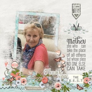
Mothers Day
- Jam-on-toast
- Media item
- #cheeryofave #mother's day karen schulz celebrate women
- Comments: 3
- Category: Karen Schulz Designs
-

Comment by 'Jam-on-toast' in media 'Lost in a Book'
Oh, this is fabulous indeed! A work of art that conveys a feeling... Love the pops of yellow!- Jam-on-toast
- Gallery comment
-

Comment by 'Jam-on-toast' in media 'Challenge #1 Border.jpg'
Gorgeous border! Love the blending... your page makes me want to go grab a book...- Jam-on-toast
- Gallery comment
-

Comment by 'Jam-on-toast' in media 'Pizza Night'
Ha ha... this is what our Friday night is all about...- Jam-on-toast
- Gallery comment
-

Filling up my cart ...
Oh yeah... scrapbooking and getting scrapbooking supplies are etirely different hobbies...- Jam-on-toast
- Post #8
- Forum: Chatter
-

Comment by 'Jam-on-toast' in media 'comfort zone.jpg'
lol... it is always fun to dress up and attend a fancy event... I really love the cluster blended into the background!- Jam-on-toast
- Gallery comment
-

Comment by 'Jam-on-toast' in media 'inspiration of the mind.jpg'
This is such a cool page Debra! Congrats on being featured in GSO!!! I really love the splash of color on your otherwise blakc and white page!- Jam-on-toast
- Gallery comment
-

Comment by 'Jam-on-toast' in media 'Twirl it out 2015 Mommy & Me2'
Excellent use of white space! Love the minimalist approach to embellishing that lets your photo shine!- Jam-on-toast
- Gallery comment
-

Comment by 'Jam-on-toast' in media 'Purple Scent'
Absolutely superb clustering! And that wicker frame is super cute!- Jam-on-toast
- Gallery comment
-

Comment by 'Jam-on-toast' in media 'Thomas Ruyant 01 05 22 à Dunkerque'
What a great page design! Love how you visually split the page into thirds and placed your journaling in between the masts... Simply awesome!- Jam-on-toast
- Gallery comment
-

Comment by 'Jam-on-toast' in media 'Joy'
Awesome boy page! Love the blending and the colors that coordinate with your photos! Those stamp photo frames are super cute!- Jam-on-toast
- Gallery comment
