Oscraps
Search results
-

Comment by 'Jam-on-toast' in media 'Defi2 janvier espace blanc.jpg'
wow... stunning!- Jam-on-toast
- Gallery comment
-

Comment by 'Jam-on-toast' in media 'not my problem'
This made me chuckle... love that brad!- Jam-on-toast
- Gallery comment
-

Comment by 'Jam-on-toast' in media '23-01_O_RJefferies-Mixed-Media-Challenge'
WOW... the butterfly just pops! Love all the brushwork!- Jam-on-toast
- Gallery comment
-

Pretty Exciting updates for 2023 ...
How exciting!- Jam-on-toast
- Post #3
- Forum: ==> What's new at the O
-

Time for a New Siggy and Avatar...
Great minds think alike... a few days ago I did just that!!! I used one of my previous layouts as avatar and decided to go minimalistic on my new signature.- Jam-on-toast
- Post #10
- Forum: Scrap Chat
-

Comment by 'Jam-on-toast' in media 'Challenge #2 - january 2023'
Sonja, pages like this frustrate me! In a good way... They look so simple, yet i find it impossible to create something like this...- Jam-on-toast
- Gallery comment
-

Comment by 'Jam-on-toast' in media 'WORK IN PROGRESS'
This is so cool, Ona! I love your clustering... I really do.... and the fact that you placed your photo almost in the centre, yet the whole page still looks balanced and not symmetrical...- Jam-on-toast
- Gallery comment
-

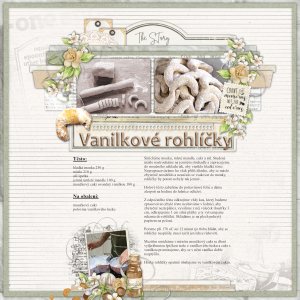
Favorite Recipies
I just love this kit - mostly because it has tons of non-foliage elements... though I used mostly flowers and strings here... Thank you for looking.- Jam-on-toast
- Media item
- karen schulz favorite family recipes baking
- Comments: 2
- Category: Karen Schulz Designs
-

Comment by 'Jam-on-toast' in media 'Moment Captured'
OMG... thank you so much... totally unexpected but much appreciated- Jam-on-toast
- Gallery comment
-

Comment by 'Jam-on-toast' in media '23-01_O_Challenge-#2---2023-January-White-Space'
I have just seen your layout in the white space shallenge thread... Wow... this looks so good! And so simple... I'm in awe....- Jam-on-toast
- Gallery comment
-

January Challenge #2 - White Space
Thank you for the challenge. Using no more than five elements was harder than I imagined. I used: wordart (blended) frame scrabble tiles wordart camera scatter- Jam-on-toast
- Post #7
- Forum: JANUARY 2023 CHALLENGES
-

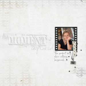
Moment Captured
Created for the White Space challenge here - use no more than five elements and a background paper. Gosh, this was DIFFICULT... I changed the kit and the photo and the whole idea three times before I knew what I was doing... I finally decided that the white space on my page would symbolize the...- Jam-on-toast
- Media item
- #cheeryo #white space challenge #2 et designs
- Comments: 7
- Category: Oscraps Cheery O's
-

What lines are you excited about in January 2023?
Wow.. this sounds like an exciting breakthrough...- Jam-on-toast
- Post #5
- Forum: Scrapbook Genealogy/Heritage
-

Do You Dream about Digi scraping??
I have had soe crazy dreams... but not about scrapping... I rarely remember my dreams in such vivid details, though... usually all that remains once I wake up is a feeling...- Jam-on-toast
- Post #16
- Forum: Chatter
-

OScraps Siggie Jan 2023.jpg
Just for fun..- Jam-on-toast
- Media item
- #siggy
- Comments: 1
- Category: Member Galleries
-

Comment by 'Jam-on-toast' in media 'Christmas Facetime Again'
Wow... what a great photo!!!! Love you Facetime action shot!- Jam-on-toast
- Gallery comment
-

Comment by 'Jam-on-toast' in media 'Gather'
This is so vintage! Love it!- Jam-on-toast
- Gallery comment
