Oscraps
Search results
-

Comment by 'musicmom3' in media 'Arriving'
We got over everything pretty quickly too because of the fun component, but the one thing that twisted my brain was that by removing a chunk of the fence, the pool was accessible to the grands directly from the house. No gate. Never would have rented if the photos had shown how the house is...- musicmom3
- Gallery comment
-

Comment by 'musicmom3' in media 'Joe-Edith through the years'
Super heritage page! I love all the views--and that plate.- musicmom3
- Gallery comment
-

Comment by 'musicmom3' in media 'A Cherished Story'
This is such a universal heart story and your telling of it is absolutely splendid. What a tribute in both words and pictures. Simply radiant. (And Tilly sure is a character.)- musicmom3
- Gallery comment
-

Comment by 'musicmom3' in media 'anna-aspnes-digital-scrapbook-artplay-collection-rhapsody-diane-Ozprom.jpg'
Such a handsome boy! LOVE that bolo tie! (Needs a swanky black hat though for that real Bat Masterson look LOL.) Great use of the extraction.- musicmom3
- Gallery comment
-

Comment by 'musicmom3' in media 'AnnaColor Challenge 06.17.2023 to 06.29.2023 - Rainbow Edition.jpg'
Love this, especially how the rainbow bow and the rainbow in the sky play together!- musicmom3
- Gallery comment
-

Comment by 'musicmom3' in media 'anna-aspnes-digital-scrapbook-travel-template-album-7-diane-fathers-day.jpg'
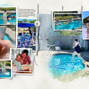
Nice pool page! I just finished one--and it was a bear working with my photos. I'll have to imitate some of your details...I like how you incorporated a different photo as a mat--that colorful tube photo on the first page. It's enough to give a hint, and really anchors the colors.- musicmom3
- Gallery comment
-

Comment by 'musicmom3' in media 'Anna Color Challenge - Synesthesia'
Congrats on that Standing O! I can't quite get over the organization, logic, and cohesiveness of this design. Plus the info is fascinating. Truly awesome work!- musicmom3
- Gallery comment
-

Comment by 'musicmom3' in media 'AnnaColor-Challenge-thru-06.29.2023-Rainbow-Edition_A-SPECIAL-PLACE'
Love the little touch of rainbow!- musicmom3
- Gallery comment
-

Arriving
First spread of this year's family vacation album, missing documentation of two of the kids, who went out on a run for provisions AKA “beer run.” I used the first spread from the new Travel Template album for this layout, and didn't alter the templates much, just removed all but one of the...- musicmom3
- Media item
- Comments: 11
- Category: Anna Aspnes
-

Comment by 'musicmom3' in media 'Arriving'
It's going to be a loooooong project!- musicmom3
- Gallery comment
-

Comment by 'musicmom3' in media 'Arriving'
What I've learned from this trip (and others) is "don't rent a house with no or few reviews." If nothing else, it signals an inexperienced landlord who probably hasn't yet made all the usual mistakes. This guy, e.g., who is just getting started renting, didn't do a seasonal tune-up on the HVAC...- musicmom3
- Gallery comment
-

Comment by 'musicmom3' in media 'And Then it Hailed - Left'
Thrills and chills! The weather can change LIKE THAT! One of the not-so-fun things of boating--I am always looking at the sky. PS: Now I want a Buster Bar from DQ!- musicmom3
- Gallery comment
-

Comment by 'musicmom3' in media 'Let's Ride - Left'
Love your adventure! And a meal to top off the day!- musicmom3
- Gallery comment
-

Comment by 'musicmom3' in media 'AnnaColor Challenge'
Wow! Bursting with life and color!- musicmom3
- Gallery comment
-

Comment by 'musicmom3' in media 'Lets Swim!'
I like the focus on the book! Lots of beautiful detail to enjoy here!- musicmom3
- Gallery comment
-

Comment by 'musicmom3' in media 'Paradise...'
Ah, what a fantasy! Perfectly portrayed.- musicmom3
- Gallery comment
-

Comment by 'musicmom3' in media 'january 9-10'
I am really happy to see that happy thumbs up! Good combination of photos and text/texture blocks.- musicmom3
- Gallery comment
-

Comment by 'musicmom3' in media 'January 11'
Layouts that document the big emotions are always some of my favorites. Excellent titlework. "Oh No" says it all, and I like how you used the dateline.- musicmom3
- Gallery comment
