Oscraps
Search results
-

Comment by 'Kythe' in media 'July Challenge #6.jpg'
It is a font that came with PSE22 called Book Antiqua Bold. What I did was put a large 'F' on a layer. Then placed a blue paper on a layer over it. With the paper highlighted clip the paper to the letter. That created the letter in the blue paper. You can then move the paper around to get...- Kythe
- Gallery comment
-

Object Selection Tool
PSE 22 has the selection tool. I don't know if it is the same but it is pretty decent.- Kythe
- Post #10
- Forum: Scrap Chat
-

How often do you try something new?
I force myself to go into the 'unknown' as it keeps my creativity alive. Having said that I will admit I practice certain types of LOs to get comfortable with them. The fantasy ones do take a bit of free thinking but the ones I find the hardest is AJ.- Kythe
- Post #3
- Forum: Scrap Chat
-

Comment by 'Kythe' in media 'July22_Challenge 7 - Quote to Wordart'
Creative use of layering, graffiti and font variety. The title work with the cutout lettering gives strength to the word 'everything'. A great example for the challenge.- Kythe
- Gallery comment
-

Comment by 'Kythe' in media 'BE Magia - MagicalReality1'
Ditto. The figures are unique and perfect for the quote.- Kythe
- Gallery comment
-

Comment by 'Kythe' in media 'Who stole my mojo?'
Excellent vertical flow to the design. The simple background stamps/sketches add just the right amount of layering to keep the minimal design.- Kythe
- Gallery comment
-

Comment by 'Kythe' in media 'BE Charmed Whispers1 MagicaReality'
That eye has the viewer transported at first glance. A very magical page indeed.- Kythe
- Gallery comment
-

Comment by 'Kythe' in media 'wow'
A well deserved Standing O. Super title and clever design.- Kythe
- Gallery comment
-

Comment by 'Kythe' in media 'Refresh the Soul'
Very interesting blending and use of opacity to get such lovely results.- Kythe
- Gallery comment
-

Comment by 'Kythe' in media 'Vicki Robinson - July 2022 Challenge'
Fun page and super use of the photos.- Kythe
- Gallery comment
-

Comment by 'Kythe' in media 'chang sha-bop'
I always did like songs that had a catchy tune and easy to remember nonsense phrases. Now I will be singing those all day!- Kythe
- Gallery comment
-

Comment by 'Kythe' in media 'Take a Hike magazine cover'
That is fantastic. I live only a few hours from there. The title is a clever play on words and the photos inspiring.- Kythe
- Gallery comment
-
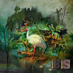
Challenge 4.jpg
What impressed me about the Florida Highwaymen is the bold colours and emphasis on nature.- Kythe
- Media item
- #anna aspnes designs #cheeryo #foxeysquirrel
- Comments: 8
- Category: Challenge 4
-
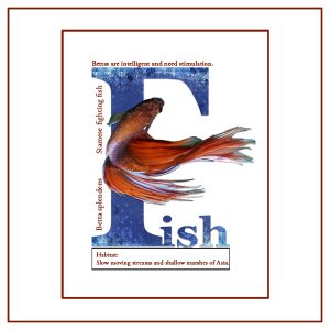
July Challenge #6.jpg
I took my cues from hildy's gallery entry 'Lecture' . I used the block letter F to give information about the Betta Fish.- Kythe
- Media item
- #cheeryo #joyful heart designs challenge #6
- Comments: 8
- Category: Challenge 6
-
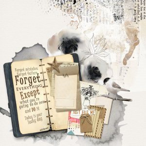
July Challenge 7 Quote to Word Art.jpg
- Kythe
- Media item
- #cheeryo #emeto designs #maya de groot #vicki robinson designs challenge #7
- Comments: 3
- Category: Challenge 7
-

July Challenge #1 The Agency.jpg
Join me for July's Challenge 1! Fulfill your job in the 'magazine biz' and create a cover page for a travel magazine. Check out the details in the forum.- Kythe
- Media item
- #cheeryo #simplette scrap
- Comments: 3
- Category: Challenge 1
-
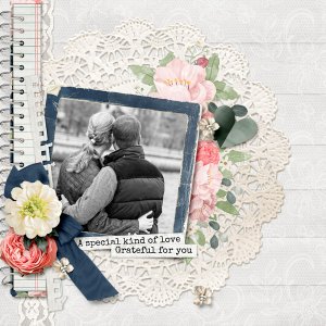
True Love.jpg
- Kythe
- Media item
- #cheeryo #crk designs love
- Comments: 1
- Category: Oscraps Cheery O's
-
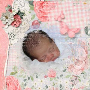
Sweet Dreams.jpg
The background paper was created using masks on the kit papers and merging into one paper.- Kythe
- Media item
- #cheeryo #crk designs baby girl
- Comments: 1
- Category: Oscraps Cheery O's
-
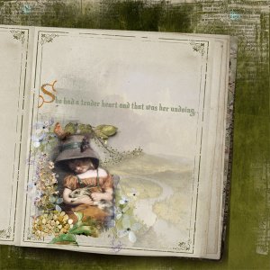
Tender Hearted.jpg
- Kythe
- Media item
- #foxeysquirrel storybook
- Comments: 1
- Category: Foxeysquirrel
-
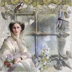
Rebecca.jpg
- Kythe
- Media item
- #foxeysquirrel fantasy feminine romance
- Comments: 1
- Category: Foxeysquirrel
