Oscraps
Search results
-

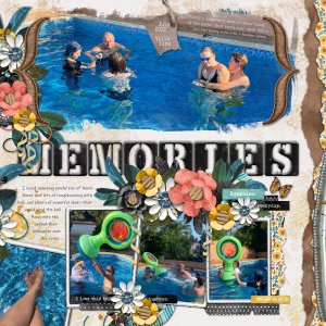
Memories
The right-hand side of my two-pager documenting summer 2022.- Jam-on-toast
- Media item
- #cheeryo #connection keeping #summer
- Comments: 5
- Category: Oscraps Cheery O's
-

Comment by 'Jam-on-toast' in media 'Connection Keeping Zipper Template 02'
wow.. this is very creative! Love the beads and how you worked around the zippers and the stitches.- Jam-on-toast
- Gallery comment
-

Comment by 'Jam-on-toast' in media 'mothers and daughters'
Such a sweet photo! Love the blended one and the fading frame... Simply beautiful! Thank you for sharing!- Jam-on-toast
- Gallery comment
-

Comment by 'Jam-on-toast' in media 'Secrets'
Gosh, this is soooo beautiful!- Jam-on-toast
- Gallery comment
-

Comment by 'Jam-on-toast' in media 'Household of Faith 7-MultiplePhotos'
WOW... this is so creative! love the house!- Jam-on-toast
- Gallery comment
-

Comment by 'Jam-on-toast' in media 'Color Challenge...'
wow... amazing use of color!- Jam-on-toast
- Gallery comment
-

Comment by 'Jam-on-toast' in media 'visite du musée d'Orsay'
Absolutely fantastic blending! Love the visual effect and the torn frame! Here's a Standing O from me! #110- Jam-on-toast
- Gallery comment
-

MARCH 2023 - Standing O's
And this page by @myla is so eye catching!- Jam-on-toast
- Post #110
- Forum: Standing O's
-

Comment by 'Jam-on-toast' in media 'Metamorphosis'
Totally awesome page! Love the colors! Congrats on the Standing O!- Jam-on-toast
- Gallery comment
-

Comment by 'Jam-on-toast' in media 'Anna Color Challenge 03.18.03.30.2023.jpg'
Congratulations on the Standing O! Totally well deserved!- Jam-on-toast
- Gallery comment
-

Comment by 'Jam-on-toast' in media 'Following my heart'
Lynn, I've been meaning to give you a Standing O for a while now. I love your clustering style - banners and large flowers and a variety of shapes... This page is the perfect example! I love the way you placed your title and the brushwork in the background! Love the two buntings echoing one...- Jam-on-toast
- Gallery comment
-

MARCH 2023 - Standing O's
This page by @Lynn Grieveson is simply awesome!- Jam-on-toast
- Post #109
- Forum: Standing O's
-

Comment by 'Jam-on-toast' in media 'près du Louvre'
I came to give you a Standing O but see someone has already beaten me to it. Congrats! Totally well deserved!- Jam-on-toast
- Gallery comment
-

Comment by 'Jam-on-toast' in media 'Challenge 6 Copycat'
Congrats on the Standing O! SOOOO totally well deserved! Love everything about your page! The colors and the banner are awesome!- Jam-on-toast
- Gallery comment
-

Comment by 'Jam-on-toast' in media 'peekaboo -'
This is such a creative page! Love the colors and the whole idea...- Jam-on-toast
- Gallery comment
-

Comment by 'Jam-on-toast' in media 'compétition de gymnastique de Perrenchies 26 03 23.jpg'
Triangles are very eye-catching!- Jam-on-toast
- Gallery comment
-

Comment by 'Jam-on-toast' in media 'Let Everything you do be done with Love !'
Absolutely LOVE the vase! Gorgeous layout!- Jam-on-toast
- Gallery comment
-

Do you spent much time on your mobile phone?
I spend TONS of time on my phone, but not really scrolling... I do my emails, grocery shopping, work scheduling, communication related to school/delivery/household/work/payments and transfers... I search for recipes, plan weekend trips... my whole life is on my phone...- Jam-on-toast
- Post #11
- Forum: Chatter
-

Comment by 'Jam-on-toast' in media 'AnnaLift Challenge 03.17.23-03.31.23.jpg'
The use of white space - and the white background - is fantastic, giving the design a clean and elegant feel. The pops of yellow are a great addition, providing a vibrant contrast that makes the page really stand out.- Jam-on-toast
- Gallery comment
