Oscraps
Search results
-

Comment by 'LDArtist' in media 'challenge 7'
Okay this is fabulous! Great idea using circles through out the page, even in the background! Not to mention the puppy is adorable!!!! Super page!- LDArtist
- Gallery comment
-

Comment by 'LDArtist' in media 'Eat a Cookie'
Yea! Love that quote! I'm all for that! LOL Love your choice of backgrounds! It all came together beautifully! Yum!- LDArtist
- Gallery comment
-

Comment by 'LDArtist' in media 'eyes'
I like how you used the scribble behind the photo. Great idea! It's a wonderful page!- LDArtist
- Gallery comment
-

Comment by 'LDArtist' in media 'First Birds 2021'
What a great way to start the new year! Love the mask work, with the texture and clock it all adds up to a fabulous page!- LDArtist
- Gallery comment
-

Comment by 'LDArtist' in media 'Challenge 7 White Space'
Love the texture and the skater an frame all comes together wonderfully!- LDArtist
- Gallery comment
-

Comment by 'LDArtist' in media 'O Snap'
Oh snap! So well done. Absolutely LOVE this!- LDArtist
- Gallery comment
-

Comment by 'LDArtist' in media 'White Space Challenge'
Nice work, love how the ribbon covers the photo just slightly. Lace and cluster bring it all together. Lovely page!- LDArtist
- Gallery comment
-

Comment by 'LDArtist' in media 'love'
Adorable! Love that photo (they're hard to shoot) and the title fits perfectly! One beautiful page!- LDArtist
- Gallery comment
-

Comment by 'LDArtist' in media 'love you'
Love the choice of colors used. An amazing photo and page!- LDArtist
- Gallery comment
-

Comment by 'LDArtist' in media 'Love you more'
What a wonderful idea! So well done, an adorable page! Love it!- LDArtist
- Gallery comment
-

Comment by 'LDArtist' in media 'White Space Challenge Jan 2021'
Simply lovely! Well deserved Standing O!- LDArtist
- Gallery comment
-

January 2021 - Standing O's
I adore this page by Florida Granny I love how her elements all have that modernistic flare that line up right with her photo of a 60s motel. The arrows allow the eye to sweep downward right to her photo, he circular scratch bringing the eye home. I think it's just a fabulous page!- LDArtist
- Post #42
- Forum: Standing O's
-

Comment by 'LDArtist' in media 'Jan Challenge 7 - White Space'
I can see why you'd like to shoot those older buildings and their signs. So much fun! The page is a great way to show off your photography! Your elements all have that Modernism flare that matches the photo. It makes it a really wonderful page! Very frame worthy! Hang it on the Wall!- LDArtist
- Gallery comment
-

Comment by 'LDArtist' in media 'A little birdie told me . . .'
Such a beautiful page! Sweet and serene- LDArtist
- Gallery comment
-

Comment by 'LDArtist' in media 'never talk about 2020'
Oh I LOVE that title! Love all the beautiful colors through out the page! Especially love the hearts overlaying the photo. Congrates on your Standing O!- LDArtist
- Gallery comment
-

Comment by 'LDArtist' in media 'Jan 2021 Designer Challenge'
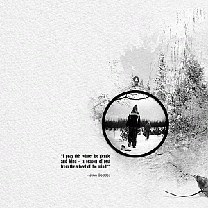
Beautiful way to quiet the mind. Charming page. Let's hope we all find comfort each and every day!- LDArtist
- Gallery comment
-

Comment by 'LDArtist' in media '2021'
Love how the elements keeps my eye moving along the page! Very clever! Let's all hope 2021 moves us into a better time!- LDArtist
- Gallery comment
-

Comment by 'LDArtist' in media 'HAPPY PLACE'
Beautiful, beautiful page! Lovely colors to go with that charming picture! And the overlap cluster is marvelous! I can see why it's your special place to unwind!- LDArtist
- Gallery comment
-

Comment by 'LDArtist' in media 'my comfort foods'
OMG that pasta looks SO GOOD! Love the page, the colors, and the elements! I especially like that way the spaghetti is coming off the page! So well done! Only problem it's making me HUNGRY! LOL- LDArtist
- Gallery comment

