Oscraps
Search results
-

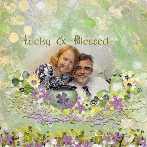
Lucky & Blessed
For the border under the photo, I added additional elements and then added a small bevel to the scatters at the base of the border. The background is two papers. The bottom layer is a green artsy paper. The top layer is a yellow painty paper and the underlying layer slider was used to determine...- scribler
- Media item
- #cheeryo #karen schulz designs #masks #romance #st. patty's day lucky
- Comments: 2
- Category: Karen Schulz Designs
-

February Art Journaling Challenge #1
I want to thank everyone who participated this month in our new art journal challenges. Our March challenges will begin soon.- scribler
- Post #29
- Forum: Art Journaling - Monthly Challenges
-

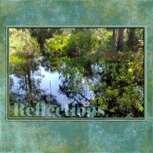
Reflections
The alpha and the stroke I used for the frame are the only things used on the page other than the solids in the paper pack. The background consists of three solid papers. The bottom paper is the darkest blue paper. The middle layer is a medium green-blue paper with a blend mode of overlay. The...- scribler
- Media item
- #cheeryo #colorplay #joyful heart designs #nature & outdoors
- Comments: 1
- Category: Joyful Heart Designs
-

Comment by 'scribler' in media 'Signs of Spring'
Great corner element clusters and I love the way you framed that photo!- scribler
- Gallery comment
-

Comment by 'scribler' in media 'Sunflower Girl'
Absolutely gorgeous art journaling page!- scribler
- Gallery comment
-

Comment by 'scribler' in media 'lucky me'
Great element clustering and I love how you used that photo!- scribler
- Gallery comment
-

Comment by 'scribler' in media 'Rabbit'
Such a great page with that cute photo!- scribler
- Gallery comment
-

Comment by 'scribler' in media 'Blackpool'
My favorite pages are always the ones that have photos/memories with real meaning to me. You did a gorgeous job scrapping this pic of your mom.- scribler
- Gallery comment
-

Ch-ch-ch-changes!
I love this collection and your pages are so good!- scribler
- Post #9
- Forum: ==> What's new at the O
-

How many layouts a month do you do?
Me too cause I'm thinking 10 - 12 most months.- scribler
- Post #14
- Forum: Scrap Chat
-

February Challenge #4 - Big Photo
Here's my page. I had so much fun blending this photo.- scribler
- Post #63
- Forum: FEBRUARY 2023 CHALLENGES
-

Comment by 'scribler' in media 'Hall-of-Fame-Emmitt.jpg'
There is no way I could skip over a layout of Emmitt Smith. I am such a huge Cowboys fan and he was such a great player. This is such a great football page! Love it!- scribler
- Gallery comment
-

Color Play February 2023 - Come Share Your Layouts
I absolutely love this month's Color Play. I've done five layouts so far and may not be done. lol- scribler
- Post #30
- Forum: ==> What's new at the O
-

Comment by 'scribler' in media 'SOUNDS OF THE EARTH'
Fantastic page! Love the composition and your use of the text on a path. Plus all those elements at the bottom look so great!- scribler
- Gallery comment
-

Comment by 'scribler' in media 'Night Hunter'
This is absolutely so kewl! Well deserved Standing O!- scribler
- Gallery comment
-

Get So Lucky
For the blue and red/brown paints, I used the underlying layer slider to determine how much paint showed. For the white paint, I added a small bevel.- scribler
- Media item
- #cheeryo #colorplay #pets #vicki stegall designs dogs
- Comments: 1
- Category: Vicki Stegall Designs
-

Every Single Minute
I clipped the photo to a mask included in the Tones of Green collection. I then used the Undlerlying Layer Slider to blend it a little more with the background paper. For the frame, I started with the heart shaped frame with leaves already on the frame. I then added one of the Tones of Green...- scribler
- Media item
- #cheeryo #palvinka designs #romance #spring palvinka tones of greens
- Comments: 1
- Category: Member Galleries
-

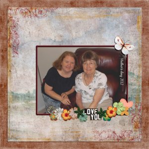
Mother's Day 2012
The frame was made by adding a new layer above the photo, selecting the photo, adding a stroke on the new layer and then adding a bevel to the new layer. I also added a color overlay to the page corners and then used the Underlying Layer slider to give them a more stamped look.- scribler
- Media item
- #cheeryo #colorplay #joyful heart designs #mother's day #vicki stegall designs
- Comments: 1
- Category: Joyful Heart Designs
-

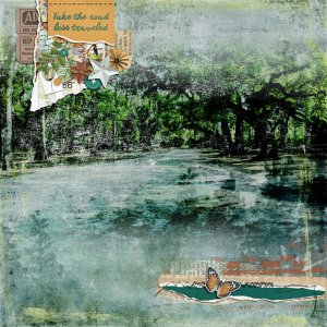
Road Less Traveled
To blend the photo, I added a white layer mask to the photo and used a black to transparent gradient on the mask to blend the top and bottom of the photo. I then set the Blend Mode to Darker Color and used the Underlying Layer slider to further blend photo.- scribler
- Media item
- #cheeryo #joyful heart designs #nature & outdoors #vicki robinson designs vicki robinson artful expressions 06
- Comments: 7
- Category: Joyful Heart Designs
