Oscraps
Search results
-

Comment by 'isDK' in media 'I love to dance . . .'
A fun photo for this challenge. So much joy! :)- isDK
- Gallery comment
-

Comment by 'isDK' in media 'Channeling the Inner Child'
Love this! Your photo and page design, and use of color. I once taught a tiny person to stick out her tongue and learned her mommy was very upset with me. Hey! I was twenty and didn't think it could be a bad thing. :D- isDK
- Gallery comment
-

2022-09 Lynn Grieveson September 2022 Color Play Challenge -through October 24th ****CLOSED***WINNER ANNOUNCED
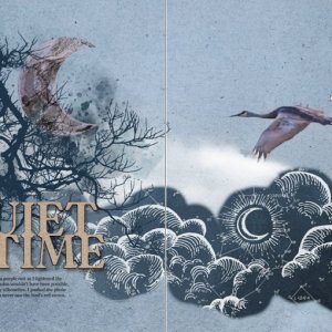
I'm back! Everything is from Nocturne and there is no template. The photo is the bottom layer in my stack. I used 2 papers, 3 mm pieces, then the moon and title elements.- isDK
- Post #7
- Forum: Lynn Grieveson Older Color Play Challenges
-

Lynn Grieveson's ColorPLAY Challenge: Quiet Time
The blue hour lighting gave the birds a purple cast as I lightened the photos. Even a few years ago those photos wouldn't have been possible, and we felt lucky even if we got mostly silhouettes. I pushed the photo processing to the max, but the camera never saw the bird's red crown.- isDK
- Media item
- Comments: 5
- Category: Lynn Grieveson
-

Comment by 'isDK' in media '2022-10 Vicki Robinson October Challenge Renew the Story'
Love your use of color and the wonderful shapes. :)- isDK
- Gallery comment
-

Comment by 'isDK' in media 'Autumn in Ohio/Rachel mixed media chall'
Ohio Highways. A magazine as famous as Arizona Highways used to be. You could go on and on. This is a wonderful reminder it's not all about the big cities. :cool:- isDK
- Gallery comment
-

Comment by 'isDK' in media 'Season Change/Anna color chall'
I'm late to finding this, and everyone has pointed out what makes this page so wonderful. Love the weed element that suddenly is dispersing these same seeds as in the photo it feels like. I also love that she wants to enjoy this seed delivery process so much she's fine with getting those seeds...- isDK
- Gallery comment
-

Comment by 'isDK' in media 'anna-aspnes-art-play-luster-digital-art-diane-beach-night'
Sorry you got the crud. Love the dark gray paper and white text with these photos. So lucky you could have fires. It's been years now they're banned here.- isDK
- Gallery comment
-

Comment by 'isDK' in media 'Golden Autumn'
Gorgeous leaves and I love your art journaling. :)- isDK
- Gallery comment
-

Comment by 'isDK' in media 'anna-aspnes-digital-art-artplay-collection-autumncheer--GreatHornedOwl'
I've never seen mine but he's been talking right outside my window for years. So nice you have a photo! Beautiful page too.- isDK
- Gallery comment
-

Comment by 'isDK' in media '22-10_O_October-Challenge-#3---Fonts'
Love this green neutral with the fall color. Really beautiful. :)- isDK
- Gallery comment
-

Comment by 'isDK' in media 'anna-aspnes-art-play-luster-digital-art-castles'
A really nice ending. I think it's the white space that makes it special for finishing it up. ;)- isDK
- Gallery comment
-

Comment by 'isDK' in media 'Seasons of Life'
Congrats on GSO. Love the portrait with the tree behind him, the red leaves embedded in the paper, and the ribbon with the red brad. :cool:- isDK
- Gallery comment
-

Comment by 'isDK' in media 'Défi AnnaColor 10.07.2022 - 10.20.2022'
A beautiful place and I love your blending, the daisy, and touches of white. :cool:- isDK
- Gallery comment
-

Comment by 'isDK' in media 'anna-aspnes-digital-art-artplay-Autumn-Cheer-collection-ksacry Fall Leaves'
Congrats on the Standing O! I love your sketch treatment. ;)- isDK
- Gallery comment
-

Comment by 'isDK' in media 'Lost in Time'
Beautiful page and the blending. Everything working so well to flow and fitting together. ;)- isDK
- Gallery comment
-

Comment by 'isDK' in media 'Beautiful - AnnaColor'
Love how the button and lace and the two frames highlight how delicate these flowers are. So pretty and I don't know them, kind of like some we'd find at very high altitude. ;)- isDK
- Gallery comment
-

Comment by 'isDK' in media 'anna-aspnes-digital-art-stitched-template-artplay-autumn-cheer'
Oof. I've been trying to recover from our last trip and way behind again. Glad you're well on the way to mending.- isDK
- Gallery comment
-

Comment by 'isDK' in media 'anna-aspnes-digital-art-artplay-Autunm Cheer Collection-Jerri Lantz-Play'
Awww. I love that they feel safe with you so close. And how your two frames make me think of maybe you're seeing them through binoculars.- isDK
- Gallery comment
-

Comment by 'isDK' in media 'Letchworth Drive'
I looked at the trees and the 'vette emblem and my mind didn't take in the stitching and page design as much as just off to feeling the wind in the hair part. Love how this brings back a wonderful road trip. :cool:- isDK
- Gallery comment
