Oscraps
Search results
-

Comment by 'Esk' in media 'Love'
Unbelievable. You did it again. What a wonderful beautiful amazing LO. This one is going into my Inspiration-folder; LOVE this!!!- Esk
- Gallery comment
-

Comment by 'Esk' in media 'sweet .... most days.'
I feel like a broken record, but: WOW. How DO you do it? I just LOVE the way you "handle" letters, text, words. How you make that the focus of your page, but still in a way that highlights the photo (if you use any). I'm in awe.- Esk
- Gallery comment
-

Comment by 'Esk' in media 'Love found'
Ooooh, I LOVE this new style of yours! The way you've placed the two photos is sheer brilliance. Wow! Wow! Wow! Did I say wow? :D- Esk
- Gallery comment
-

Comment by 'Esk' in media 'Bedfellows'
Such a priceless story; I really really love this! Totally agree that this should be in the Standing O's! :)- Esk
- Gallery comment
-

Comment by 'Esk' in media 'Me'
What a terrific series of photos; they, and YOU, are so beautiful! What a wonderful way to showcase them!- Esk
- Gallery comment
-

Comment by 'Esk' in media 'Days to remember'
You're back! :D I missed seeing your gorgeous designs in the gallery! I'm glad I can ooh and aah over them again! And this one is a wonderful one; totally love what you did with the double border line!- Esk
- Gallery comment
-

Comment by 'Esk' in media 'sweet child of mine'
I LOVE what you've done with the template; it's so you! Amazing!- Esk
- Gallery comment
-

Comment by 'Esk' in media 'and suddenly and then'
Soooooo beautiful! I absolutely LOVE this! And through this "sneakpeek" I'm very curious as to what that kit will look like. :D- Esk
- Gallery comment
-

Comment by 'Esk' in media 'Nature'
Absolutely lovely; I really love the softness of this page!- Esk
- Gallery comment
-

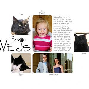
Familiepresentatie
The daycare of my dd asked us to do a 'familypresentation' for on their wall, so I did this LO. (I kept it really simple -without any papers or elements- on purpose, so the little ones at daycare can focus on the photos...) Translation: Weijs Family I'm Famke and I live on a houseboat...- Esk
- Media item
- Comments: 2
- Category: TaylorMade Designs
-

Comment by 'Esk' in media 'September 2009 Desktop'
Beautiful design! I LOVE the colors you've used, and what a gorgeous photo!!- Esk
- Gallery comment
-

Comment by 'Esk' in media 'Beautiful in Red'
This is completely and totally gorgeous! I love the photo, the wordart you've used, but most of all: all the reds you've used. Fabulous!!! This is going straight into my inspiration-folder! :)- Esk
- Gallery comment
-

Comment by 'Esk' in media 'The tape measure'
Beautifulbeautiful design! This is going straight into my Inspiration-folder!- Esk
- Gallery comment
-

Boris is trots op papa
Translation: Boris is proud of daddy On sunday all of us had dinner at 'De Boerderij'. There [my little nephew] Boris HAD to have his picture taken with his superdad. Credits: Template: Press Plate No. 12 by Paislee Press Staples: I live for by Vinnie Pearce Fonts: Harrington + Century...- Esk
- Media item
- Comments: 1
- Category: Member Galleries
-

Comment by 'Esk' in media 'All My Heart (2)'
Just look at him, being soooooo little; such a big difference with the latest photos I've seen. They really do grow up too fast, don't you think?- Esk
- Gallery comment
-

Comment by 'Esk' in media 'All My Heart (1)'
Awwwwwww, such cute and happy photos! And they go really well with the papers you chose!- Esk
- Gallery comment
-

Comment by 'Esk' in media 'Life Is Beautiful (2)'
Oooh, great job on the stitching! And I agree with cellomom: that photo is just too cute!- Esk
- Gallery comment
