Oscraps
- Credits list
- Credits:
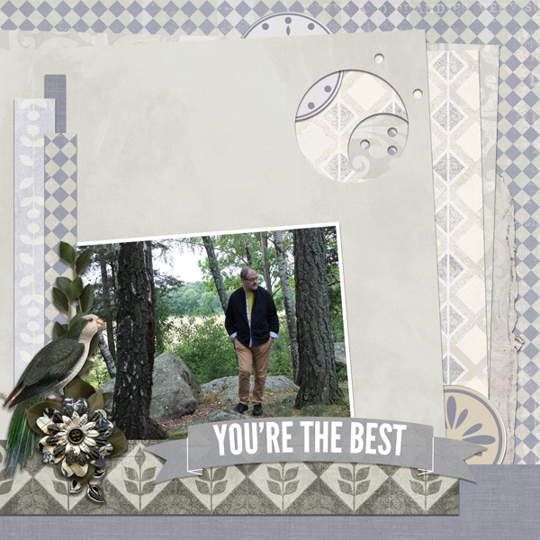
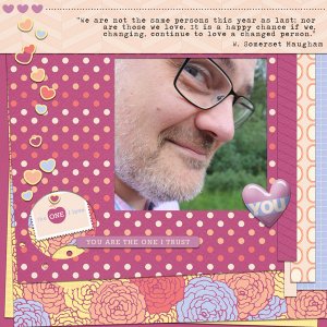
The Absolute Best Collection by Veronica Spriggs
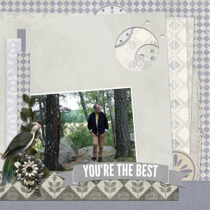
Photo: my own
For this layout I started with a new empty document and built a sort of paper stacking template by duplicating and resizing squares and stacked them on top of eachother. When I was satisfied with the stacking, I used the eraser tool and a simple circle brush, and erased circles out of the stacked layers. After that I used papers from the kit and clipped on to the different layers. Then added the photo, added a white stroke around it, and finally added the elements.
- Designer(s) Used:
