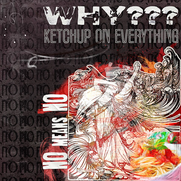
This is awesome and stood out in the Gallery so I had to come and take a look! There are so many parts to this page I keep looking and looking and finding more to like. Your background with the subtle "no"'s is perfect and the figure coming out of the dish is genius. I like your use of color and your title and placements are so creative, this is really cool and beautiful too!
This site uses cookies to help personalise content, tailor your experience and to keep you logged in if you register.
By continuing to use this site, you are consenting to our use of cookies.