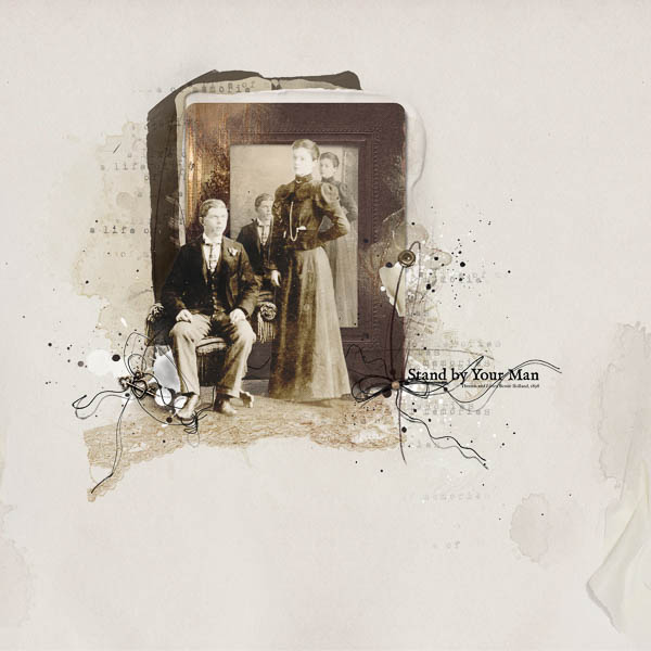
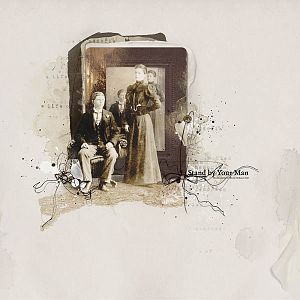
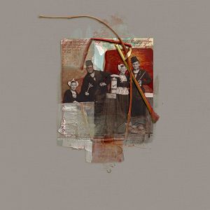
I really don't know why women stood while the man sat in old wedding photos, so I'm improvising in thinking that my husband's grandmother was saying by her pose that she'd stand by this man. This grandfather died fairly early in a car accident leaving his grandmother a widow with five fairly young children.
Anna Aspnes
Artsy Transfers Memorable (coming soon)
ArtPlay Palette Memorable [url=
http://www.oscraps.com/shop/product.php?productid=10012135&cat=383&page=1]ArtPlay Palette Memorable[/url]
MultiMedia Frames No. 2 [url=
http://www.oscraps.com/shop/product.php?productid=10012134&cat=383&page=1]MultiMedia Frames No. 2[/url]
Faded Words Memories No. 1 [url=
http://www.oscraps.com/shop/product.php?productid=10012132&cat=383&page=1]Faded Words Memories No. 1[/url]
Artsy Stains No. 7 [url=
http://www.oscraps.com/shop/product.php?productid=10012133&cat=383&page=1]Artsy Stains No. 7[/url]
ArtPlay Palette Tinge [url=
http://www.oscraps.com/shop/product.php?productid=10011771&page=1]ArtPlay Palette Tinge[/url] lace
Around the Clock No. 1 [url=
http://www.oscraps.com/shop/product.php?productid=45070&page=1]Around the Clock No. 1[/url]
ArtPlay Palette Autumn Elegance [url=
http://www.oscraps.com/shop/product.php?productid=10010515&page=1]ArtPlay Palette Autumn Elegance[/url]
Spray Paint No. 2 [url=
http://www.oscraps.com/shop/product.php?productid=27966&page=1]Spray Paint No. 2[/url]
Font: IM FELL English
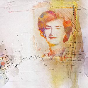
Process: Inspired by Adryanes post at Somerset, [url=
http://stampington.com/blog/2015/01/27/photo-manipulation-tutorial-postcard-home-adryane-driscoll/]Postcard[/url] and her layout [url=
https://ozone.oscraps.com/gallery/showphoto.php?photo=324749&title=annalift-01241528word-for-word-29&cat=1351]word for word[/url], I began with this wedding photo of my husbands grandparents in 1898. I used the pen tool to extract the couple, pasted it on a layer mask. I then created a composite and added a levels layer to lighten it a little. Next I duplicated that composite and changed the blend mode of the top layer to color burn. I placed the couple above multimedia frame_2 and then used the warp tool to create a floor and added a layer mask to erase parts of the frame. I placed a frame from ArtPlay Autumn Elegance along with another copy of the photo behind the standing couple. Because I had warped the foreground of the extracted couple, the framed photo looks more like it is standing behind them. I added the lace following Adryanes instructions, adding a color fill layer on color burn. I placed solid paper_3 at 75% on linear burn blend mode above solid paper_3. Below the framed photo, I added two copies of the memories wordart and several of the new artsy stains which I recolored. I added a little spray paint on the right to balance overlay_1 on the left. I placed the clock face below the stains on the left, changed the blend mode to multiply and reduced the opacity to 40%. I layered the thread from multimedia frames2_1 between the extracted photo and the framed photo to enhance the depth. I added the artsy transfers just above the solid paper, recoloring some layers, adjusting the blend modes and deleting other layers to create greater depth in my background. I moved the artstroke above the framed photo. I changed the color of the charm and tied it down with a thread. On the right, I used a thread from the multimedia frames and recolored the pearl with a hue and saturation layer. The font is something used in print at the time this photo was taken.
Thanks for looking:)