Oscraps
- Credits list
- Artplay Rhapsody Collection
Artplay Palette Rhapsody
Music WordART Cluster No.1
Other
FotoInspired Template Pack No.3B
Paper Textures No.18
Splatters No.15
Oasis No.1
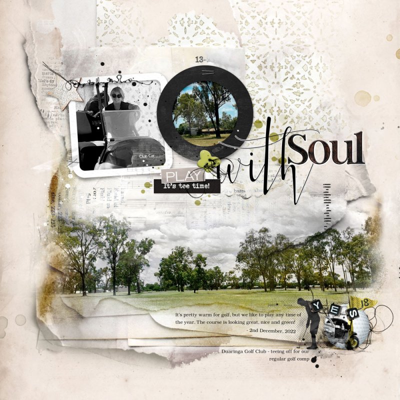
Process An Artsy Paper is the Background for this Layout, with a Hue/Saturation Adjustment Layer placed on top to adjust the colour. My Focal Image was duplicated and placed on top of the Background. The Image was Blended via Blending Modes and an adjustment layer to knock out the blue. Supporting Images were clipped to Frames from page 6 of the FotoInspired Template Pack No.3B. One Image was extracted and desaturated. A WordART Cluster was placed on top of the Layout. A White Stroke and Drop Shadow were applied to the WordART. Dimensional Elements, a Pictorial Brush and Splatters were added to the page. Paper Textures were placed on top of the Image. Journaling completed the Layout.
- Designer(s) Used:


