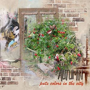
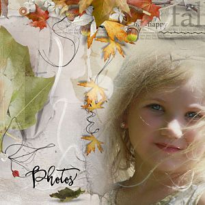
I took this photo a couple of years ago in the park behind town. Ive used it in other layouts since then, and I never tire of it. It looks different in each layout.
AnnaRelease 5 September 2014
AnnaRelease5September2014
The release includes:
ArtPlay Palette Artsy
Create WordART No. 1
Dripped WaterColors No. 1
MultiMedia Art No. 1
ArtsyLayered Template No. 160
Additional Supplies:
ArtsyTransfers Artsy
ArtsyTransfersArtsy
12 x 12 FotoBlendz Canvas Overlays
FotoBlendzCanvasOverlays
DifferentStrokes No. 11
DifferentStrokesNo.11
DifferentStrokes No. 9
DifferentStrokesNo.9
ArtsyStains No. 2
ArtsyStainsNo.2
DrippedStains No. 6 (Retired)
ButtonThreadz No. 2
ButtonThreadzNo.2
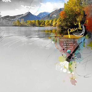
Photo: Mine
Font: Traveling Typewriter
Process Notes: Solid paper 3 as my foundation, I brought in my photo, making a copy and turning it to black and white which I placed under the color photo. Bringing in AT 5 and turning off all the layers except the two large paint layers, I duplicated the color photo and clipped them to the paint layers revealing the bottom black and white photo towards the left. I wanted the color photo to reach more towards the opposite edge so I created a layer just above the first clipped photo and with an AnnaBlendz brush I created another mask to which I clipped a third color photo. All of these clipped masks were left on Normal blend mode.
Bringing in a couple of the dripped watercolor and placing them within the AT layers, I again clipped the color photo to each of them after duplicating the photos again. I put one on Hard Light and the other on Vivid Light.
Underneath all these layers, I placed the 12 x 12 canvas FotoBlendz, rotating and placing it at the top of the page and clipped all the photos which I had linked together to it, creating a seamless blend. (The original photo goes 3/4 down the page.)
From there I turned the visibility of the parts of the artsy transfers on, recoloring, resizing and repositioning where needed as well as blending. I used the colors from the photo. I added the scribbles from the palette.
Adding all the layers of the psd paint brush and leaving them as is, I added more stains, recoloring and positioning them running down the page.
Placing the title and coloring it from the photo and blending to Linear Dodge and using some different strokes brushes to splatter the word art and placed some scribble overlays from the palette under it. I tucked in another word art in the clouds above the mountains, recoloring sky blue.
Typing out the quote in white, then placing the button and threads, completed this layout, although I did that early in the process as I usually do.