Oscraps
- Credits list
- Credits:
6x6 ArtsyKardz Wonderful
ArtPlay Palette Getaway
WoodShop Canvas No. 1
UrbanThreadz No. 2
All by Anna Aspnes
Alpha - Stamped Alpha by Maya de Groot
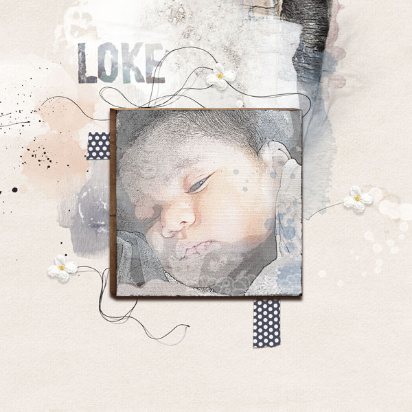
I started with one of the ArtsyKardz and the tutorial from Chris Asbury in the AnnaNews newsletter, but I changed so much I lost track of things, I probably lost some steps. But mainly I opened the ArtsyKard, and hid all layers except the background, then I added a square photo on top of it and edited as in the newsletter. Then I added layer after layer on the ArtsyKard, changed colors and blending modes if necessary. The biggest transfer layer I clipped a copy of the saturated photo on to, and changed the blending mode to Overlay (opacity 75%), to create a little bit more color to his face. Added the ArtsyKard to the WoodShop Canvas and changed the blending mode to Linear Burn. Finally made a layout of it using the new Getaway Palette and the threads. Used an alpha from Maya de Groot, clipped one of the transfers from the palette onto it, and changed the blending mode to Multiply.
- Designer(s) Used:


