Oscraps
- Credits list
-
Thank you to @jenn33199 for the beautiful LO to scraplift!
Kit: Blossom Collection — https://www.oscraps.com/shop/Blossom-Full-Collection.html by Vicki Stegall
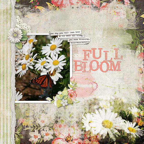
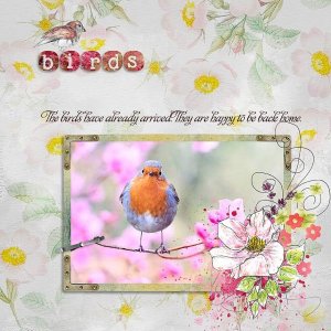
I used the basic design of Jenn's page for my own with the placement of the photos and borders. I also incorporated some of the messy paints and floral elements.
I made my background by blending two papers (Linear Burn) the erased some of the center area of the top paper using a layer mask. I also used masks to soften the edges of the blended photo on the bottom corner. I duplicated my photo and used Overlay and Soft Light Modes.
- Designer(s) Used:

