ArtPlay Palette Sunkissed[url=
http://www.oscraps.com/shop/ArtPlay-Palette-Sunkissed.html]ArtPlayPaletteSunkissed[/url]
ArtsyTransfers Sunkissed[url=
http://www.oscraps.com/shop/ArtsyTransfers-Sunkissed.html]ArtsyTransfersSunkissed[/url]
ArtPlay Palette Sojourn[url=
http://www.oscraps.com/shop/ArtPlay-Palette-Sojourn.html]Art{;au{a;etteSpkpirm[/url] Coin
ArtPlay Palette Portiere[url=
http://www.oscraps.com/shop/ArtPlay-Palette-Portiere.html]ArtPlayPalettePortiere[/url] (Brush)
ArtPlay Palette Blossomurl=
http://www.oscraps.com/shop/ArtPlay-Palette-Blossom.html]ArtPlayPaletteBlossom[/url] (Brush)
ArchiTextures No. 4[url=
http://www.oscraps.com/shop/Architextures-No.-4.html]ArchiTexturesNo.4[/url]
Dripped Stains No. 1[url=
http://www.oscraps.com/shop/Dripped-Stains-No.-1.html]DrippedStainsNo.1[/url]
ArtPlay Vitality FotoBlendz[url=
http://www.oscraps.com/shop/ArtPlay-Vitality-FotoBlendz.html]ArtPlayVitalityFotoBlendz[/url]
UrbanStitchez No. 6[url=
http://www.oscraps.com/shop/UrbanStitchez-No.-6.html]UrbanStitchezNo.6[/url]
UrbanStitchez No. 8[url=
http://www.oscraps.com/shop/UrbanStitchez-No.-8.html]UrbanStitchezNo.8[/url]
UrbanStichez Leaves No. 1[url=
http://www.oscraps.com/shop/UrbanStitchez-No.-1.html]UrbanStitchezNo.1[/url]
UrbanStitchez Leaves No. 1[url=
http://www.oscraps.com/shop/UrbanStitchez-Leaves-No.-1.html]UrbanStichezLeavesNo.1[/url]
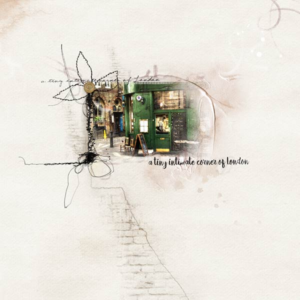
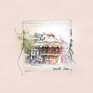
Photo: Public Domain
Fonts: FG Rakel Regular and Hellena Script Regular
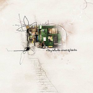
Process Notes: Placing the Vitality mask on solid paper 2 from Sunkissed I clipped the photo to it, then duplicated it two more times. The original photo is Normal blend mode, on the first copy I used the watercolor filter and Soft Light Blend Mode at 100% opacity. The second copy of the photo I used the stamp filter with a taupe color instead of the black as per usual, and it is on Overlay with 100% opacity. It really brightened up an otherwise dull photo.
I got ArtsyTransfer Sunkissed 3 and placed all the parts I used over the photo, resizing, rotating and blending, all of it subjective to the photo and underlying paper. I put the art strokes from the transfer at the left side of the photo. I used the large stain from the transfer to bring out more of the green of the building another part of the transfer covered up on the right edge and put it on Color Burn blend mode at 100% opacity. I pulled the texture below the photo and over the paper. It just takes a little experimentation.
I also used a couple of overlays from Sunkissed on the left side of the photo, resizing to fit and a large overlay to span the page, to swoop across the top of the photo and up into the right corner.
From there I placed my title along the top and bottom of the photo using two different fonts and sizes creating coming and going lines, so to speak.
Then it was time to finesse the layout with brushes, using stains, the brick, and along the left edge of the photo with a stamp from the Blossom Palette. And lets not forget the crack running down the page from Portiere. All of them were colored from the Sunkissed Palette. I also put a grunge brush in the upper left corner.
After placing the 1 pound coin from Sojourn and giving it a bit of drop shadow, I got out the stitchez and placed those along the edge of the photo as you can see, lining up the horizontal stitches with the title to create a straight line. There you go, a finished layout.