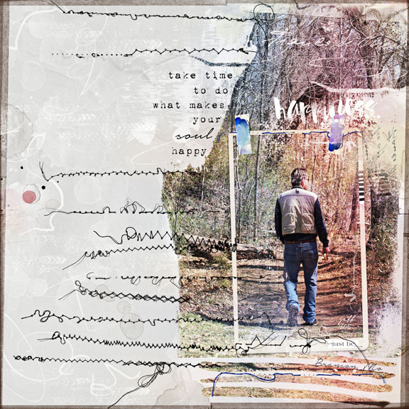
Playing with a photo from a walk several weeks ago in Branson, Mo with a friend. As he was walking ahead, I clicked several shotsalways love photos shot from behind and the perspective of the story they might tell. Being outdoors is truly what makes his soul happy.
Kits by Anna Aspnes-
ArtPlay Palette Whimsy
https://www.oscraps.com/shop/product.php?productid=10013553&cat=383&page=1
Play WordART No. 11
https://www.oscraps.com/shop/product.php?productid=10013550&cat=383&page=1
LightLeaks No. 2
https://www.oscraps.com/shop/product.php?productid=10013552&cat=383&page=1
UrbanStitchez No. 11
https://www.oscraps.com/shop/product.php?productid=10013551&cat=383&page=1
Arrows No. 1
https://www.oscraps.com/shop/product.php?productid=10012439&page=1
ArtPlay Palette Ablaze (overlay)
https://www.oscraps.com/shop/product.php?productid=29044&page=1
Page Process-
The photo was clipped to brush_10 from the AP Whimsy and both were resized. I wasnt happy with the look so I PLAYED a bit and added brush_6 to the top and brush_1 to the bottom. I simply duplicated the photo and slipped one above brush_6 layer and the other above brush_1 layer and clipped them to each of these new brush layers. In simple terms I guess I used three brushes to create one fotomask that fit my liking with this photo.
Next brushes and transfers were added to randomly and placed around the photo and throughout the page to create the texture of the outdoors.
The frame and tape and staples added more rugged feel to an outdoor page and visually centered the hiker even though the photo is off centered.
The WordART and quote were added. Fonts used- 1942 report and notera
LightLeaks were added and each had the soft light blending mode applied and the opacity was decreased. This process was trial and error of using all the LightLeaks and just running through the blending modes and seeing which color combo added visual interest to the design.
Next a couple of UrbanStitchez were added and when I saw how I liked how a couple of them lined up I simply brought them all into the page and let them fall onto the page. I rotated and flipped them so no two look exactly alike even though I repeated a couple of them. I erased a few areas that overlapped onto the photo too much.
The completed page was saved as a JPEG and final step was to duplicate the JPEG and apply the hard light blending mode to the full page which increased the color in the photo further. The opacity was tweaked and the eraser at 50% was used to bring the opposite side of the page with the brushes and stitching back to the level that was comfortable for me.
Its really all about just playing with ideasnever know what might unfold!
Thanks for looking,,,,,,,,,,,,,,,,,,,,,,,,,,,,,donna