Anna Aspnes
Artsy Transfers Behold (coming Wednesday)
ArtPlay Palette Behold [url=
http://www.oscraps.com/shop/product.php?productid=10012577]ArtPlay Palette Behold[/url]
FadedWords Travel No. 1 [url=
http://www.oscraps.com/shop/product.php?productid=10012562&cat=398&page=1]FadedWords Travel No. 1[/url]
AnnaBlendz Artsy No. 4 [url=
http://www.oscraps.com/shop/product.php?productid=10012502&cat=298&page=1]AnnaBlendz Artsy No. 4[/url]
MultiMedia Branches No. 2 [url=
http://www.oscraps.com/shop/product.php?productid=46646&page=1]MultiMedia Branches No. 2[/url]
UrbanThreadz No. 3 [url=
http://www.oscraps.com/shop/product.php?productid=10008555&page=1]UrbanThreadz No. 3[/url]
Fonts: Ariadne Sans, Ariadne Script and Garamond Pro
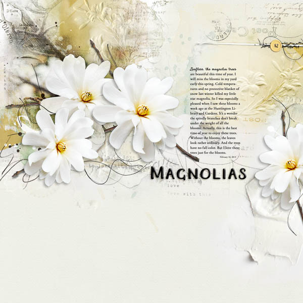
Process: I absolutely love working with these .psd transfers because I can stack multiple layers, move parts, recolor pieces, delete the layers that dont work with my photos or add layer masks to layers to make adjustments. With that in mind, I chose this photo for the Artsy Transfers Behold. I placed the photo on a new blank page and resized it. I duplicated the photo, turning off one copy for a backup, something I used later in my process. I then created a sketch with the photo using a technique that I saw in a recent newsletter from Digital Scrapper. I merged the two sketch copies and changed the blend mode to multiply at 100% opacity. This merged copy is above all the other photo copies in the background. I duplicated my original again and used a copy to mask out all but the focal flower and stems and reduced the opacity to 50%. Above that is another masked copy on color blend and two copies on overlay blend mode. Then I placed solid paper_3 from the AP. Between the paper and photos on the left are the layers of two artsy transfers, 1 and 5. I deleted four layers and applied a layer mask to two layers. I changed the color on two layers. I then went through to adjust the positions and opacity of each layer. I moved the art strokes to the top of the stack with an artstroke from the AP. On the right are the layers from transfer_4. I followed the same process as above. I placed the faded words above the background photos. Remember that original photo file, I duplicated it again, unlinked it from the original and background copies before extracting just the flower. I duplicated the flowers and changed the size of two and arranged two with the background photo and the third copy over on the right. I placed the branches below each so that they appeared much like they do on a tree. I added a subtle drop shadow to the two extractions on the left as well as the one on the right. The flower in the background may appear to have a shadow, but it doesnt. Finally, I added some threadz and used a mask on the stitchez to tack down the button. I experimented with a bevel style on the title.
Thank you for looking:)