Oscraps

AnnaLift 30-01-15
S

AnnaLift 30-01-15

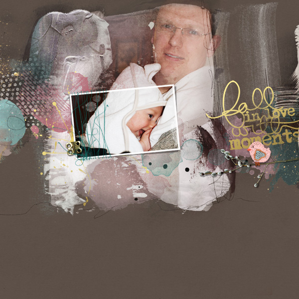
I tried to use a variety of brushes and transfers on this layout. I'm not very good with these items and I have recently been listening to Anna's videos on blending, so I tried to put some of the things I've learnt into practice. I'm not entirely happy with the layout (perhaps I chose the wrong base paper for the photo?) and I certainly think I need more practice, so any constructive comments would be most appreciated!

Credits:
Anna Aspnes:
APP: Believe, Serenity, Adventure
WordArt_MomentsNo1
UrbanThreadzFramedNo1
JazzedUpLoopDaLoopNo3

Style by B.Murry
I love what you did here with the brushwork and blending, etc. The more you work with these items the more comfortable you will feel. If you think you are unhappy with the background, I often times consider a layout done, but change out the base paper after completing a page, and am surprised at how the base paper can dramatically change a page. I do like what you did here - the colors are carried throughout the page, I love the depth created with the transfers and the layers of patterns, the slight angle of your frame, and how the framed area shows all the detail of the little one - with everything else falling back just a bit. A wonderful Artsy page!
 
You did a great job on your blending, love the way you tilted the frame, and your placement of the word art is excellent! This is very artsy. You are right, in that just playing with options helped me to learn what I liked. It is very much a matter of experimentation. Don't be afraid to change the paper background is you think it is too dark for your taste. Place a few options and turn them off and on until one stands out to you.
 
cute photo, i love combination of beigebrown, mint and rose with a touch of gold and the titlework.
 
Love the placement of the frame and how it focuses on the child. Great contrast of colors! Don't be afraid to experiment ... That's the fun part!
 
I think your result is wonderful. Beautiful work with the blending and the placement of the frame. I like the background because grey pink and white look so nice together .. but one of the beauties of digital is that you can change out the background and have a completely different page to enjoy. Looking forward to seeing more of your work in the gallery :)
 
I love the way the focus is on the baby, but still can see dad clearly. Your use of paper and transfer are really good too. Keep it up :)
 

Layout information

Category
Anna Aspnes
Added by
scrapzebidee75
Date added
View count
717
Comment count
11
Rating
0.00 star(s) 0 ratings

Share this layout

Top