Oscraps
- Credits list
- Artplay Related Collection
Artplay Palette Related (paper, clock, rick rack, bird, button (recolored), paper texture, transfers, splatters, overlay)
Related WordART Mix 1
Artplay Palett Melancholy (glasses)
Artplay Palette Hearth (fabric)
MultiMedia Documents 10 (fabric)
Process
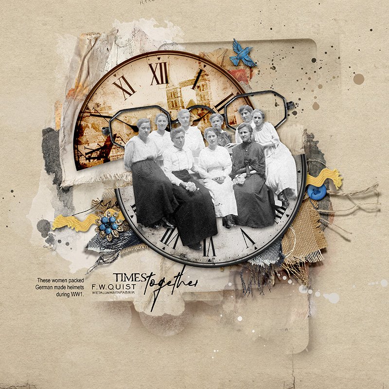
A solid paper from APP Related was used as the foundation of the page. The clock was cut in half and offsetted. A photo from a post card of a city that my great aunt grew up was clipped to the top half of the clock. The blending mode was changed to color burn. The image of the women was extracted and layered over the bottom half of the clock. A custom shadow was added. Fabric samples were added along with dimensional embellishments. The page was completed by adding transfers, paper textures, splatters and word art.
Thank you for looking!
- Designer(s) Used:
- Photo(s) Credit (REQUIRED field beginning Feb 1, 2025)
- mine


