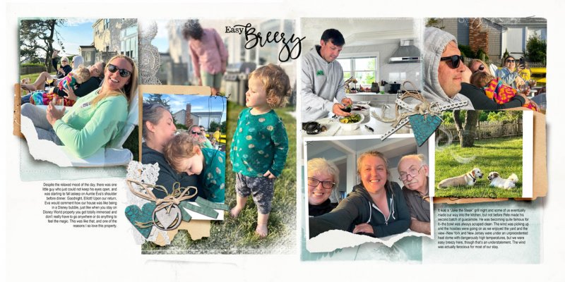
Teal is the color of the day on this layout. As I am batching the spreads in this project, I find that I am being driven by color in the photo arrangement, which helps me choose the finishing touches later down the line. Rather than scatter things all over the place, here I layered elements to make mini-clusters. In this layout, because the top is so photocentric, I wanted to keep the bottom relatively airy. I extended the photo on the left page across the centerline to take advantage of that valuable middle real estate that you get when printing flat. An unexpected and helpful side-effect of working in the “batch five, then finish five” method is that you really get a good feeling for the interactions of the shapes on the page. Without texture and embellishments, I'm finding it's a lot easer to make design choices, so there is far less angsting around to figure out if I like what I'm doing.


