Oscraps
- Credits list
-
Scenic Template Album No. 11: 4 and 5
Artplay MiniPalette Nova (free with $20 Purchase from aA Designs -valid 26 February -
4 March 2024 midnight eastern standard time)
Carpe Diem WordArt Mix No.3
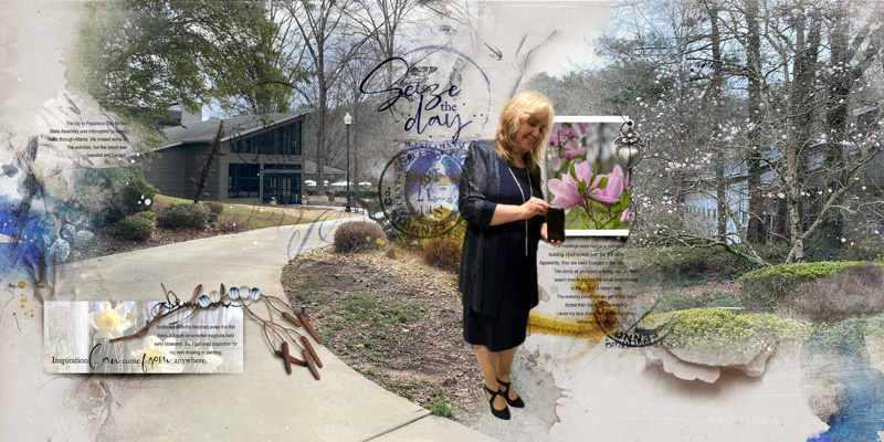
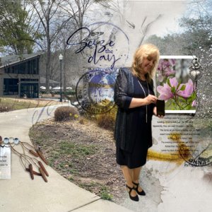
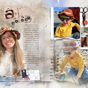
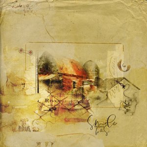
A 24 x 12 inch document was created. Both templates were dragged onto the document to preserve their layers. (They are linked together before moving them onto the design.) The FotoBlendz were filled. The photo in the frame on the left was set to overlay and a textbook was dragged to that space. The extracted figure in the middle was inspired by musicmom3's design. The Artsy Paper, brushes, and elements are from the ArtPlay MiniPalette Nova.
Thank you for looking!
- Designer(s) Used:

