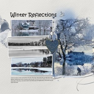
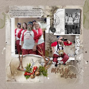
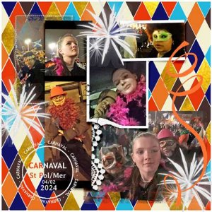
I love these New [URL='
https://www.oscraps.com/shop/FotoInspired-Template-Pack-No-3E.html']FotoInspired Templates 3E [/URL]with lots of labeled frames, torn frames, ribbons and lacy bits - perfect for the week's highlight photos and easier to embelligh.
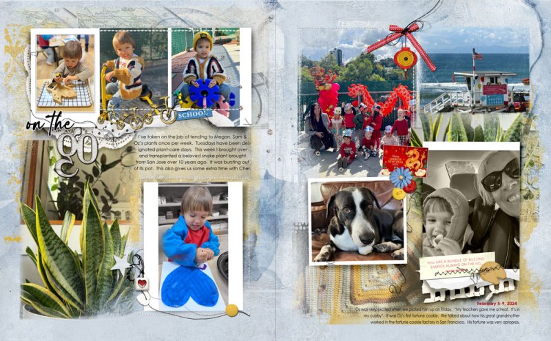
For these two pages I used Pages 4 & 3 from the templates, once again shrinking the squares then vertically stretching the entire pages to fit. I reused background papers, a blue color overlay, and transfers from my last two pages (reuse makes pages faster!!).
Then it was just a matter of clipping photos to frames and masks and working to balance - eg a plant photo on opposite sides, a sweater photo on opposite sides.
