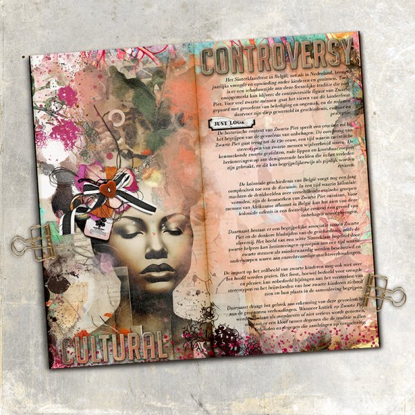
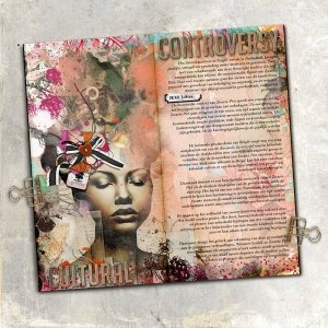
This is done so very beautiful. I love the colors, love the face and all the added elements are just perfect. I also think the alpha is done just gorgeous. As for the journaling, I find it hard to accept that there are adults who think the color of Piet is more important than the happinness of childeren. Standing O!
This is done so very beautiful. I love the colors, love the face and all the added elements are just perfect. I also think the alpha is done just gorgeous. As for the journaling, I find it hard to accept that there are adults who think the color of Piet is more important than the happinness of childeren. Standing O!
Thank you so much! And I totally agree! I wanted to represent the current “Zeitgeist” in mijn journal, maar ik vind ook dat het om de kinderen moet gaan, niet om de kleur van de Pieten.
This is done so very beautiful. I love the colors, love the face and all the added elements are just perfect. I also think the alpha is done just gorgeous. As for the journaling, I find it hard to accept that there are adults who think the color of Piet is more important than the happinness of childeren. Standing O!
for the alpha I make a custom chipboard alpha, cover it with a part of the paer (boosted contrast and saturation). Then I remove parts of the paper using a grunge brush to give itva bit of a sanded look.
This site uses cookies to help personalise content, tailor your experience and to keep you logged in if you register.
By continuing to use this site, you are consenting to our use of cookies.