Oscraps
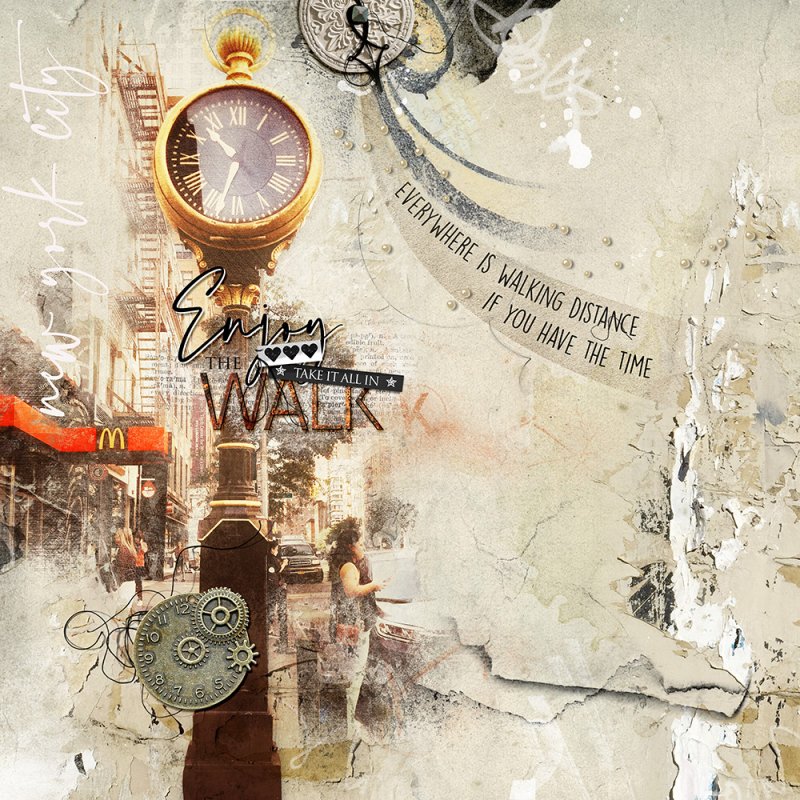
Walk
- Miki
-
- Tags
- clock new york city time walk
- Credits list
- Artplay Plumera Collection
Artplay Palette Plumera (paper, dial clock, transfers, overlay)
Artsy Transfers Plumera
Artplay Palette Paraiso (artstroke)
Artplay Palette Urbicolous (brush, metal word WALK)
Multi Media City 1
Multi Media Magic Sprinklez 4 (beads)
City WordART Clusters 1
FotoBlendz Overlays 22
Button Threadz 6
Splatters 16
Process
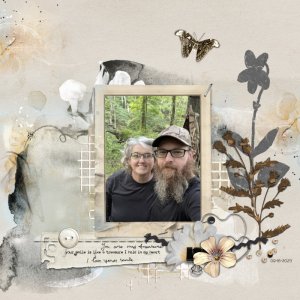
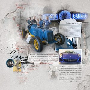
A solid paper from APP Plumera was used for the foundation of the page. The paper was duplicated and a layer mask was added. Using the gradient tool, the 2 pages were blended together, creating a larger blank area. The photo was clipped to a fotoblendz mask, duplicated with the blending mode changed to soft light. A City WordART Cluster was added, substituting the word VIEW with WALK. Transfers and overlays were added. The page was completed by adding more dimensional embellishments and word art.
Thank you for looking!
- Designer(s) Used:
