I had the same thoughts as Laura on her
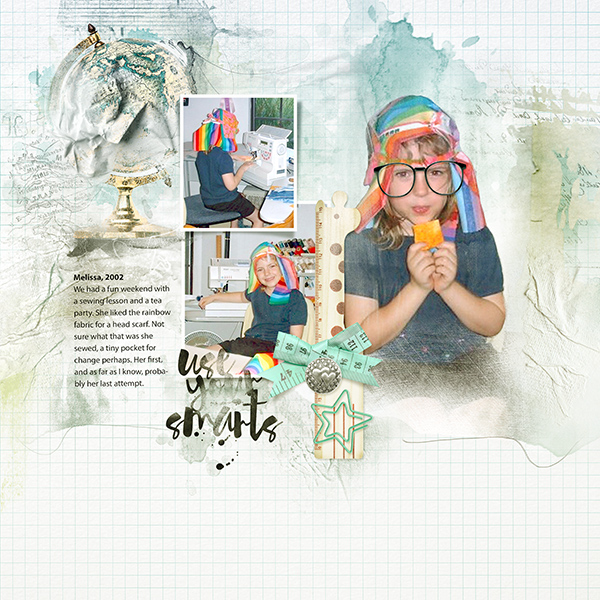
Weaving layout. I had to go way back to 2002 photos when Melissa showed some interest in sewing.
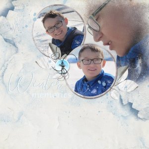
After looking at the Artsy Layered Template, I used some of the same elements from it, flipping Artsy Paper 1 and Artsy Transfer 1 horizontally and placing the small frames to the left, with photos clipped to the masks. I did a semi-extraction of the large photo, clipped to the grouped Artsy Transfer layers (some layers removed). Added elements with drop shadows, and the png file of MultiMedia Studious 1-1 behind the frame layers. Embellished with Word ART and Studious brushes. Finished with a pale teal/cream colored gradient at the top of the layer panel to help blend her navy-blue clothing with the palette colors.
