Oscraps
Listen to the Music
- Miki
-
- Tags
- 70s music record player
- Credits list
- Brush Set Bundle Music Plus
Music Notes 3
Music Type 1
Music Maestro 1
Artsy Transfers Rhapsody
Artsy Kardz Rhapsody MultiPack
Artplay Palette Rhapsody
MultiMedia Frames 8
Music WordART Clusters 1
FotoInspired Template Pack 3B (frame)
Skribble Blooms 1
Spray Paint 1 (retired)
Process
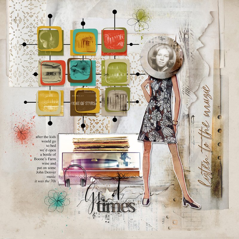
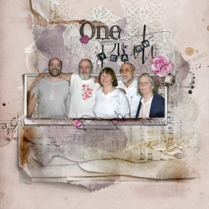
A solid paper from APP Rhapsody was used as the foundation for the page. Artsy Transfers Rhapsody_4 was added. Some of the layers were turned off or the opacity was reduced. The photo was clipped to the frame mask of the MM Frames 8_2 element. Now the fun began. To create the grid, 9 squares were made and colored. Brushes from Music Notes 3, Music Type 1, and Music Maestro 1 were clipped to them. Color was added to the brushes. A rounded corner rectangle with the center cut out was layered over the squares. Shadows were added. The grid behind the squares was made by drawing lines and adding circles. A dress model (found on a Simplicity dress pattern I had from the 70s (don't ever throw anything out, you may need it 40 years later!) was extracted with a sticker background and shadow added. My photo was clipped to a circle frame mask from FIT Pack 3B_6). The page was completed by adding skribble blooms, paint sprays, more transfers from AT Rhapsody and word art.
Thank you for looking!
- Designer(s) Used:
