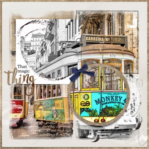
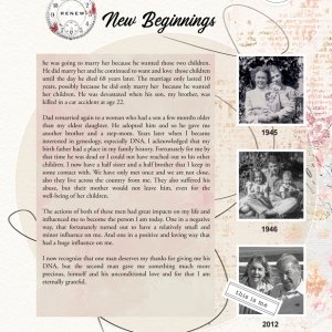
The process… I started my layout with a template from the FotoInspired Template Pack No 3B and added two solid papers. Then I started to clip my photo to the masks on the template. I decided to use two in full color and another two B&W to make a contrast. The photo in the circular frame was duplicated, I used the find edges tool in one and use the color burn to blend the two. I picked a few art stroke frames and used them on the B&W photos. Finished it by setting the word art and a small ribbon. Thanks for looking!!

