Oscraps
- Credits list
- Artplay Rainbow Collection (available until May 17, 2023)
Artplay Palette Rainbow
Rainbow Artsy Layered Template (Frames)
MultiMedia Rainbows No.1
Rainbow WordART Mix No.1
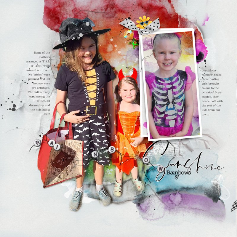
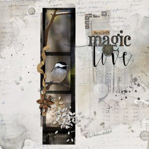
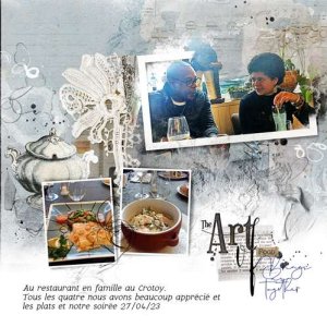
Process Two Papers and two Frames from the Artsy Layered Template were placed on top of the Background Layer. A Layer Mask and Brushes was used to allow part of the lighter background to show through. Texture, multiples Transfers and Overlays and BrushWork were placed below the Image. My Supporting Image was clipped to one of the Frames and a Paper was clipped to the other. Splatters, WordART and Dimensional Elements were added to the Page. Journaling completed the Layout.
- Designer(s) Used:
